


Smoother
HalfLeft


Source (link to git-repo or to original if based on someone elses unmodified work):
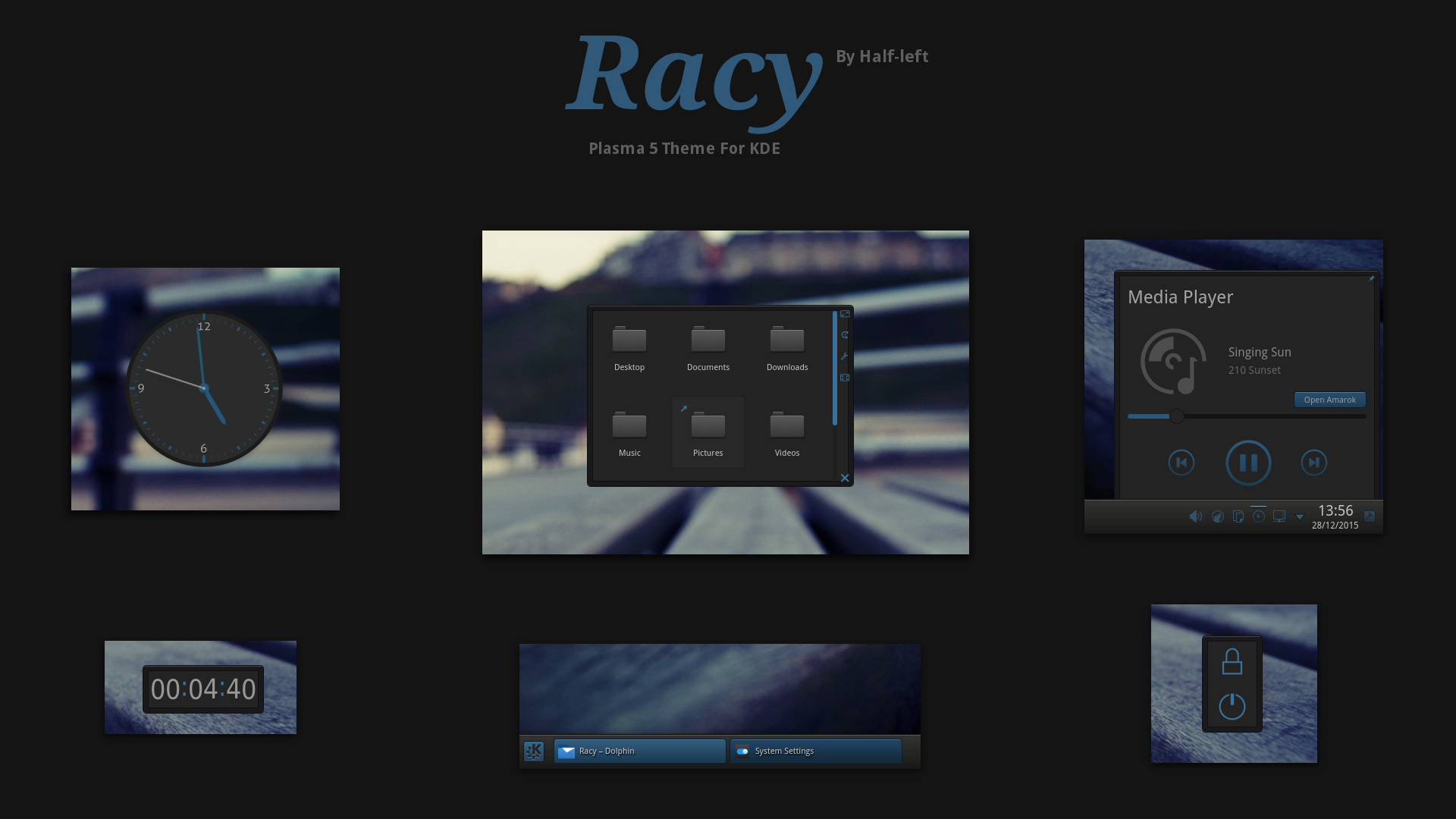
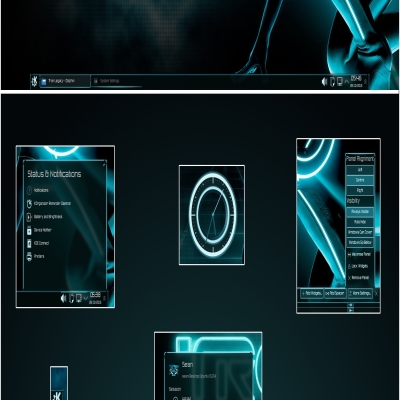
-Themed frame.svgz
-Lighter text because the original concept by the original maker is lighter. You can see it here http://kamaz-z.deviantart.com/art/Racy-UI-Concept-321668926
-Updated screenshot


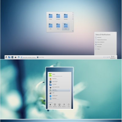
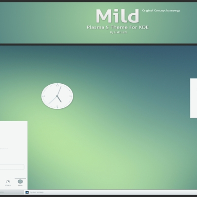
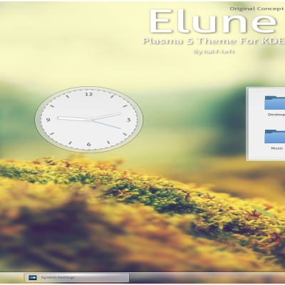
More Plasma Themes from HalfLeft:
Other Plasma Themes:

Ratings & Comments
16 Comments
Hello. Thank you for this lovely theme. I have a question for you regarding icon size. Is it theme specific, in other words: is it specified in theme? I ask because for me icon size in Plasma 5 panel are ridiculously small. Please have a look at this discussions: https://forum.kde.org/viewtopic.php?f=285&t=124799 https://bugs.kde.org/show_bug.cgi?id=349411 What do you think about it? Is it true what Eike worte: "that's just a theme that needs fixing"? If it is not theme specific can you comment on bugs.kde, please. I am not a programmer and I have no idea about themes in Plasma 5. However if it is true how can I make icons larger?
Sorry for this multiple entry. It happened when I wanted to refresh site with F5.
Hello. Thank you for this lovely theme. I have a question for you regarding icon size. Is it theme specific, in other words: is it specified in theme? I ask because for me icon size in Plasma 5 panel are ridiculously small. Please have a look at this discussions: https://forum.kde.org/viewtopic.php?f=285&t=124799 https://bugs.kde.org/show_bug.cgi?id=349411 What do you think about it? Is it true what Eike worte: "that's just a theme that needs fixing"? If it is not theme specific can you comment on bugs.kde, please. I am not a programmer and I have no idea about themes in Plasma 5. However if it is true how can I make icons larger?
Hello. Thank you for this lovely theme. I have a question for you regarding icon size. Is it theme specific, in other words: is it specified in theme? I ask because for me icon size in Plasma 5 panel are ridiculously small. Please have a look at this discussions: https://forum.kde.org/viewtopic.php?f=285&t=124799 https://bugs.kde.org/show_bug.cgi?id=349411 What do you think about it? Is it true what Eike worte: "that's just a theme that needs fixing"? If it is not theme specific can you comment on bugs.kde, please. I am not a programmer and I have no idea about themes in Plasma 5. However if it is true how can I make icons larger?
Congatulations :-) I think this is a hell of a great theme - there are so much shitty flat flat flat crap around and i thing most of them are horrible . . . This one now and and Ronak is my favorites . . Is it possible to do with, lets say green and red ? would be great for set up cool desktops . . Anyway i Love your work
Thanks. :)
Red and Green ? is that possible ?
To much work at the moment, sorry.
To much work at the moment, sorry.
I like the colors and the textures . . and it works well on KDE 4.14.2
I think it is too hard to tell the difference between the active and inactive windows on the panel task manager. Also, the words are blurred out, not sure if this is intentional or not. But, really a unique look. I like it.
I can't do anything about the text because the shadow around it is hard coded.
I just did some testing and it turns out the text shadow turns black if the color ForegroundNormal in [Colors:Window] in the colors file is set to anything above 192,192,192. Setting it to 193,193,193 (the darkest monochrome color allowed) seemed to work nicely with your theme, although you might think it goes against your vision.
Well it's not my vision, it's the text colour from the Windows version. Making the text lighter is fine, it's just doesn't match he original design.
I filed a feature request : https://bugs.kde.org/show_bug.cgi?id=357242.
I've updated the theme with lighter text, seems the original concept did have lighter text but the actual theme made didn't.