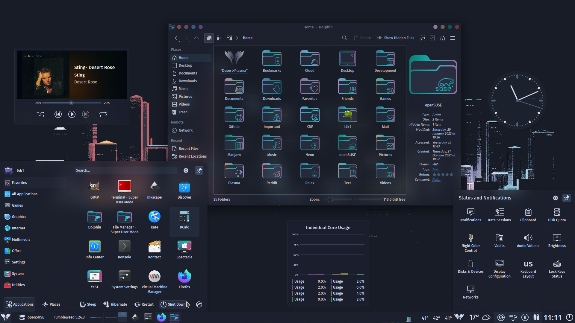
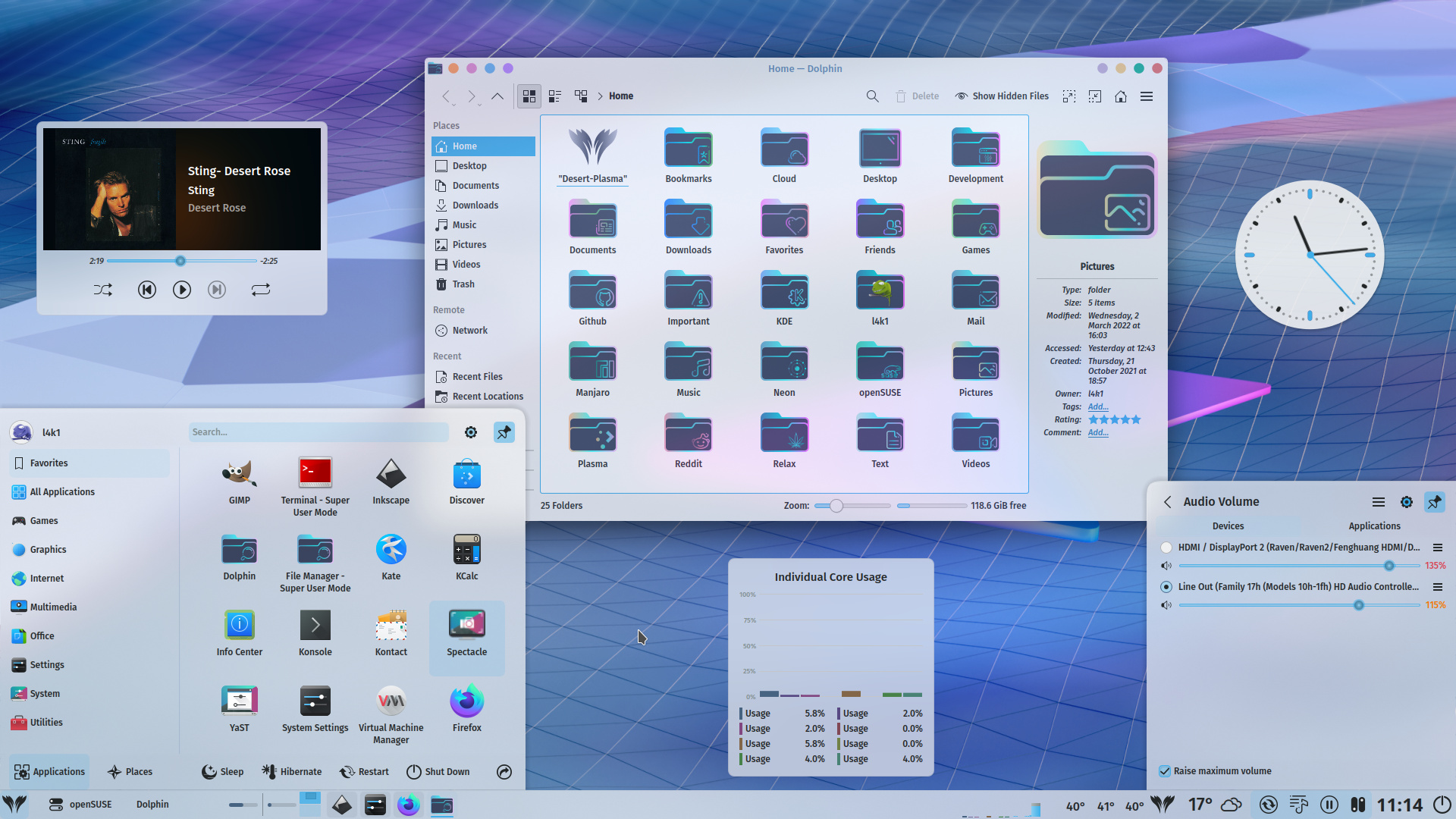
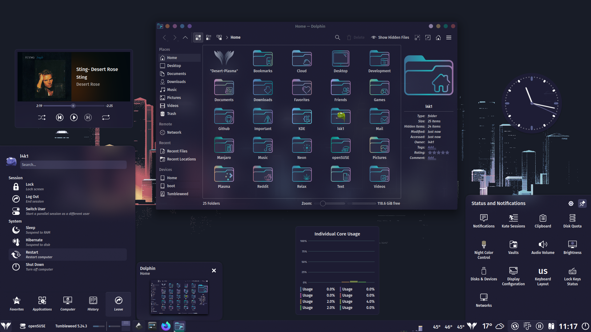
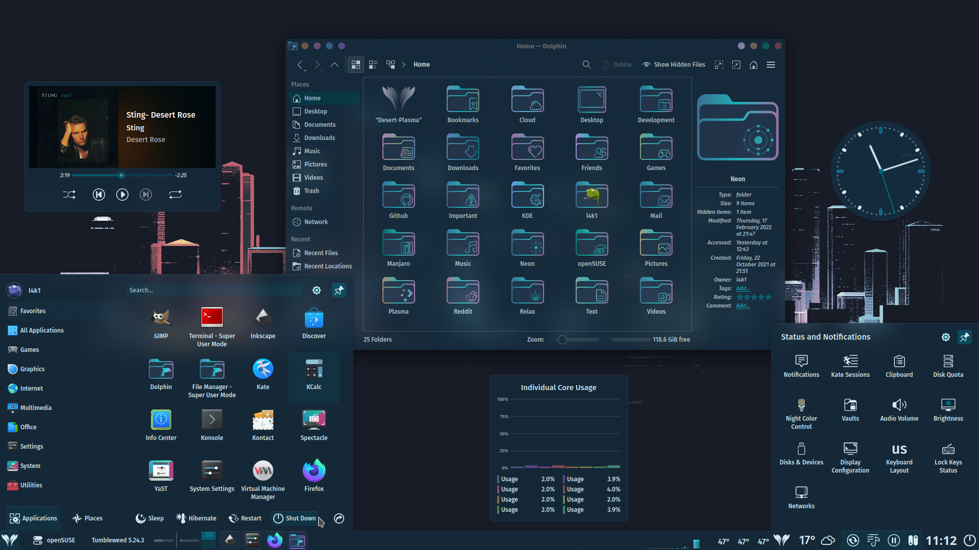
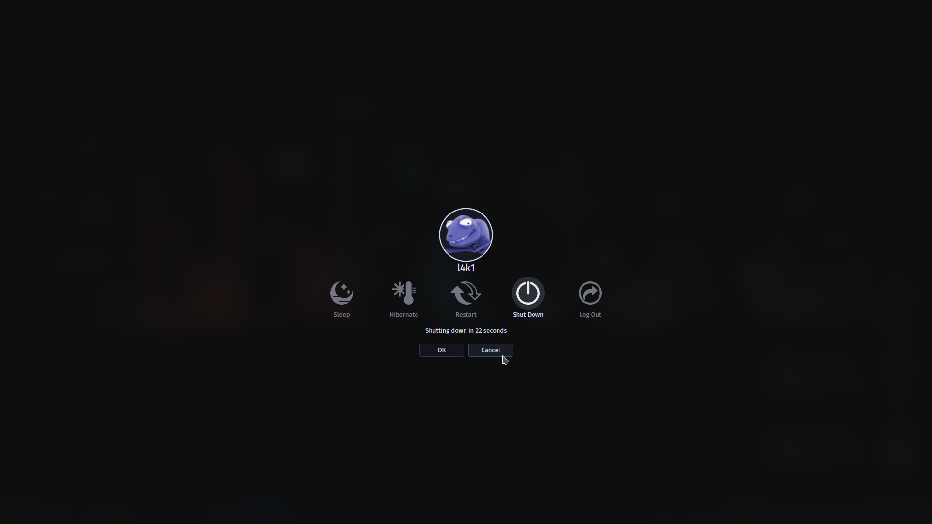
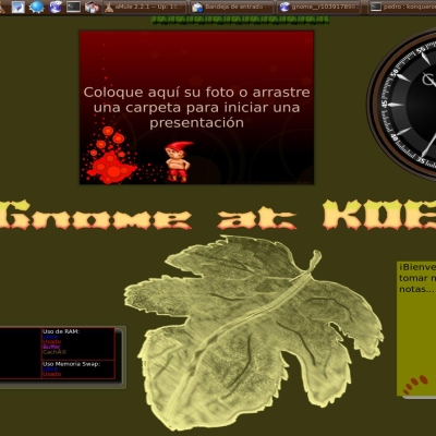
Cool! I like your busywidget. I do wish the icons were more consistent in style. The configure icon is very different. Many icons are not aligned to the pixel grid and look blurry, but that takes a long time to fix. Not sure if you meant to, but I think your slider handles' hover and focus states are set to blue (e.g. line 223?). Also, try setting the "hover-hint-" and "focus-hint-" margins in lineedit to 0.1 thickness and see if you like that better.
Thank you very much for the well-meaning tips.
I agree with you, I'll try to fix some things.
"Many Icons are not Aligned to the Pixel Grid and Look Blurry, but that takes a long time to fix."
Can you help me how to fix it.
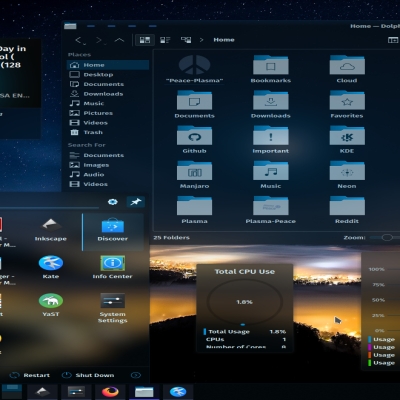
It is not easy to fix or explain. You could probably have to make a whole series on it. I can say right now that for icons to be sharp, the lines have to fit inside cells in the pixel grid. For example, a rectangular icon can look sharp, but a circle/round icon will always have "blurry" edges because it cannot fit cleanly into the squares of the grid. You can toggle the grid with "#" in Inkscape. To fix misaligned icons, I learned how to make my own. Some Inkscape features I used to make my own are: Boolean Operations, Dynamic Offsets, Defining a Grid, Bezier Curves, and Strokes.


Ratings & Comments
14 Comments
10 10 the best
Thank You very much, migue! Always appreciated.
10 10 the best
Thank You very much, shamrock! I appreciate your support.
8 8 great
Thank You very much, doncsugar!
Is this your first color compatible plasma theme?
Hi doncsugar, Yes!
Cool! I like your busywidget. I do wish the icons were more consistent in style. The configure icon is very different. Many icons are not aligned to the pixel grid and look blurry, but that takes a long time to fix. Not sure if you meant to, but I think your slider handles' hover and focus states are set to blue (e.g. line 223?). Also, try setting the "hover-hint-" and "focus-hint-" margins in lineedit to 0.1 thickness and see if you like that better.
Thank you very much for the well-meaning tips. I agree with you, I'll try to fix some things. "Many Icons are not Aligned to the Pixel Grid and Look Blurry, but that takes a long time to fix." Can you help me how to fix it.
It is not easy to fix or explain. You could probably have to make a whole series on it. I can say right now that for icons to be sharp, the lines have to fit inside cells in the pixel grid. For example, a rectangular icon can look sharp, but a circle/round icon will always have "blurry" edges because it cannot fit cleanly into the squares of the grid. You can toggle the grid with "#" in Inkscape. To fix misaligned icons, I learned how to make my own. Some Inkscape features I used to make my own are: Boolean Operations, Dynamic Offsets, Defining a Grid, Bezier Curves, and Strokes.
Thank you for your response. I'll try to master this lesson. Best regards,
9 9 excellent
Thank You very much, darg! I appreciate your support.