99 excellent! Finally! Someone "gets it" - what icons are FOR.
BOTH the Color AND Shape of an icon is to make it meaningful to you - easy to recognize and quick to pick out when you are looking for it.
Icons with a "theme" where they are ALL the same SHAPE *circles, or squares, or ovals, or foxes) or ALL the same, or all so busy & cluttered, that they are meaningless - no point in having icons at all. And toolbar icons that don't light up with color until AFTER you have already searched, found, and put the cursor on it, all with no help from it's color - what's the point of color then - entertainment? It's certainly not to help you find something quickly.
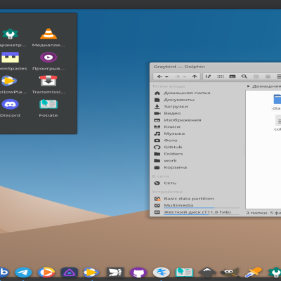
Question: what does a new default folder look like? Hopefully it is a neutral manila folder, or my preference just a vertical line so I know it is a folder, but has no icon to clash with folders I've assigned a special icon to, to stand out, grab my eye, and help me navigate nested menus quickly to my most used places.
Thx )
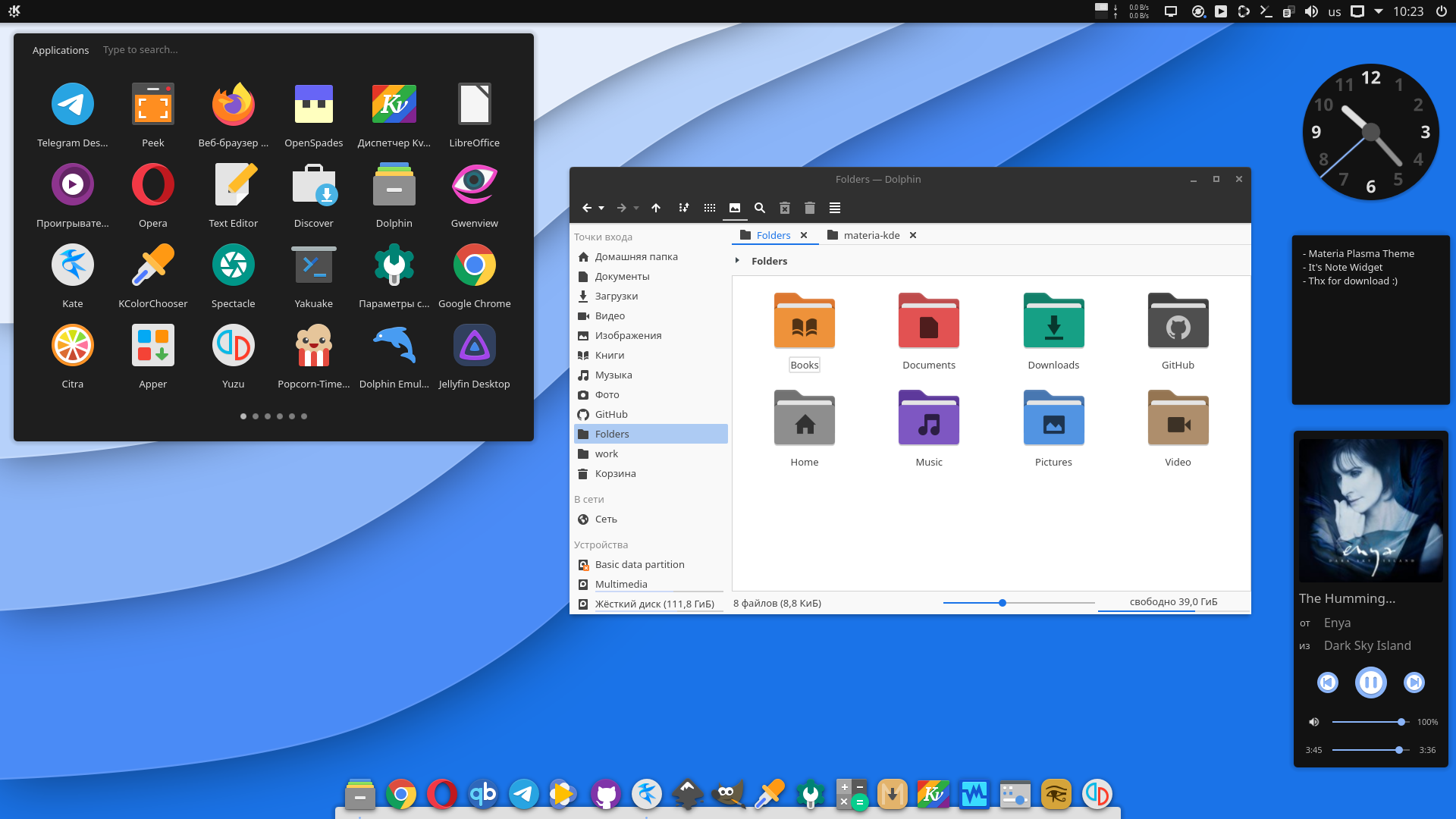
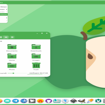
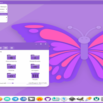
If you mean Papirus, default folder not have special symbol. Symbols available on specify folder names - downloads, documents and etc... By default used blue color, but you can change it to any color with papirus-folders script.
Material (colored) icons on theme earlier show on toooltip, but not now (plasma devs drop this). Also for highest resolutin it's will be worked too.
Anyway for monochromed icons only available Material Color plasma theme and full support KDE Color scheme.
1010 the best, simple, elegant, minimalist theme, works very well, that matte black color is spectacular and very well mixed with that blue. My Android phone is uniformed with my laptop! Congratulations for this work.


Ratings & Comments
5 Comments
9 9 excellent! Finally! Someone "gets it" - what icons are FOR. BOTH the Color AND Shape of an icon is to make it meaningful to you - easy to recognize and quick to pick out when you are looking for it. Icons with a "theme" where they are ALL the same SHAPE *circles, or squares, or ovals, or foxes) or ALL the same, or all so busy & cluttered, that they are meaningless - no point in having icons at all. And toolbar icons that don't light up with color until AFTER you have already searched, found, and put the cursor on it, all with no help from it's color - what's the point of color then - entertainment? It's certainly not to help you find something quickly. Question: what does a new default folder look like? Hopefully it is a neutral manila folder, or my preference just a vertical line so I know it is a folder, but has no icon to clash with folders I've assigned a special icon to, to stand out, grab my eye, and help me navigate nested menus quickly to my most used places.
Thx ) If you mean Papirus, default folder not have special symbol. Symbols available on specify folder names - downloads, documents and etc... By default used blue color, but you can change it to any color with papirus-folders script. Material (colored) icons on theme earlier show on toooltip, but not now (plasma devs drop this). Also for highest resolutin it's will be worked too. Anyway for monochromed icons only available Material Color plasma theme and full support KDE Color scheme.
10 10 the best, simple, elegant, minimalist theme, works very well, that matte black color is spectacular and very well mixed with that blue. My Android phone is uniformed with my laptop! Congratulations for this work.
8 I love the flat look!
9 9 excellent