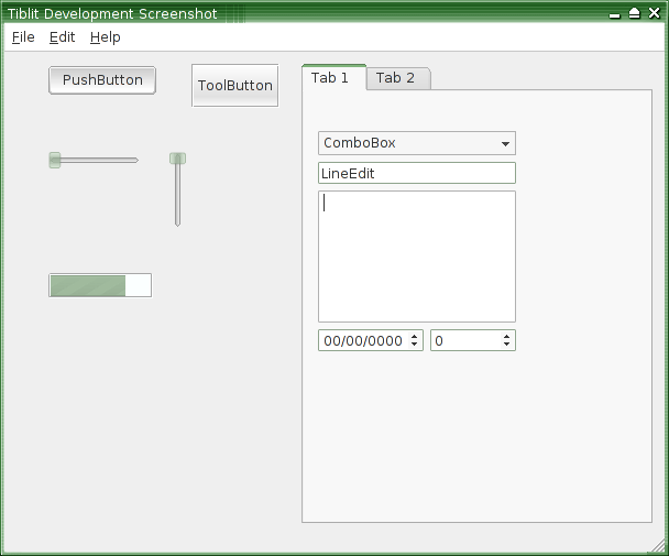
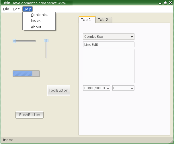
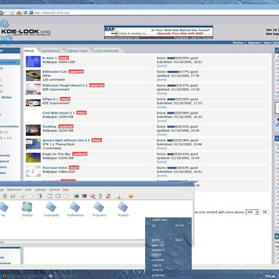
Description: The second screenshot of Tiblit 2. (Screenshot 2). Notice the curved line edits, spin boxes, individual widget colors (i.e., tabs, status bars, menu bars), new progress bars, improved tool buttons...
Looks great man!!. Disabling the icons, helps me to keep clean and simple my desktop. However, the space thing in 800x600 is very important :(
So my suggestion/question is:
-When you disable the icons, Can you reduce that "blank space" between the left menu border and the words from the menu?
That would be great... and again, excuse my english... it really sucks(hope someone understands me...).
I'm testing your cvs, and it works fine. altough i don't see mich difference (yet, i guess)... but it did look cool in 1.2, so that's not that bad.
but i have a few requests. first the sliders, i (still?) don't really like them. a way to inverse the gradients would be cool.
and second - you're making many things have sharp corners - could you provide an option to round (almost) all corners?
combobox, lineedit (if possible, i love to see these rounded). progressbar, too.
ehm, sorry about the slider, i was talking about the scrollbar :D
the slider looks really cool. the scrollbar, too, but could you inverse the groove's gradient?!? altough, it is much more clear now what is groove, and what is slider (compared to 1.2) it could still be better.
thanx for the work!
one thing i found out is that as far as i can see u r based on thin keramik
but thin keramik as as apainfully slow config dialog infact every time u switch some config the computer hangs for SEVERAL seconds, but i think that active heart whice share the same code as thin keramik is doing it way faster, so maybe u could port your code to active heart or at least try it u will immidietly fill the diffrence...
hope it helps in any way


Ratings & Comments
15 Comments
Hi any idea of the release date...?
Hi, Try to give a option to customize toolbar background color as well. I mean this should differ to appication window background color.
Good suggestion, thank you!
Looks great man!!. Disabling the icons, helps me to keep clean and simple my desktop. However, the space thing in 800x600 is very important :( So my suggestion/question is: -When you disable the icons, Can you reduce that "blank space" between the left menu border and the words from the menu? That would be great... and again, excuse my english... it really sucks(hope someone understands me...).
Done. 2.0.
I'm testing your cvs, and it works fine. altough i don't see mich difference (yet, i guess)... but it did look cool in 1.2, so that's not that bad. but i have a few requests. first the sliders, i (still?) don't really like them. a way to inverse the gradients would be cool. and second - you're making many things have sharp corners - could you provide an option to round (almost) all corners?
What has sharp corners? Mockups? Circle some things in gimp and send them along. The sliders have no gradients. Are you talking about scrollbars?
combobox, lineedit (if possible, i love to see these rounded). progressbar, too. ehm, sorry about the slider, i was talking about the scrollbar :D the slider looks really cool. the scrollbar, too, but could you inverse the groove's gradient?!? altough, it is much more clear now what is groove, and what is slider (compared to 1.2) it could still be better. thanx for the work!
Try CVS v. -- The scrollbars are smoothish, at least the vertical. I'm working the horizontal now.
i see, i like them this way. if you set the good colors, they are nice. nice job, thanx!
one thing i found out is that as far as i can see u r based on thin keramik but thin keramik as as apainfully slow config dialog infact every time u switch some config the computer hangs for SEVERAL seconds, but i think that active heart whice share the same code as thin keramik is doing it way faster, so maybe u could port your code to active heart or at least try it u will immidietly fill the diffrence... hope it helps in any way
Configuration was completely rewritten for 2.0
Are those sliders transparent? or just pseudo-transparent?
Transparent.
Nice. That's a new thing in styles as far as I know! Way to "push the envelope"!