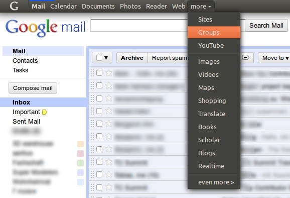
Description: This is a user style that themes that new mysterious dark panel on Google websites in Ubuntu style. When I first saw it, I just felt it reminded me of something... Ubuntu!
In order to use it, place the css file in ~/.mozilla/firefox/.default/chrome/ or ~/.config/chromium/Default/User StyleSheets/
In Opera, right click on a Google page, click the 'display' tab and choose the css file from where you saved it (for example in ~/.opera/styles)
In Internet Explorer, click Internet Options -> Accessibility -> General tab. Click the check box for "Format documents using my style sheet" and choose the css file.
I've been happily using this for the past several months. I love it.
However, with the recent changed that Google made to their UI, this now breaks things a little.
Think you could fix it?
-Ethan
First off, I absolutely love this! Very well done!
The only issue I have right now is that if I set iGoogle as my home page, the the user style crashes the page (on first run of the browser). It could well be a bug of Chromium but I'm not sure.
When I get the page crash error all I have to do is refresh the page and then it loads fine.
Previous comments: http://ubuntuone.com/p/14dA/
Text box for commenting: http://ubuntuone.com/p/14d9/
When web searching, there's a bit of the black bar showing: http://ubuntuone.com/p/14d8/
Bright backgrounds should be fixed now. I also saw the black rectangle, but I have no clue what Google is doing there. When I try to fix it on one site, the height of the menu is wrong on another site. The new Google menu is not yet final and we have to wait until it is consistently implemented on all Google sites.
Thanks! But there's also another problem...
If you have Google+ the mini profile picture doesn't fit in the bar anymore. It sticks out in an odd (but slightly cool) way.
Found another bug: http://ubuntuone.com/p/12oK/
Not sure if this is a bug, or it was intentional, but could you reverse it so that notifications that are seen become dark and unseen ones are orange: http://ubuntuone.com/p/12oJ/
I really like this Custom.css so I want to help it become bug free. Unfortunately, I have no coding capability otherwise I would be helping!


Ratings & Comments
23 Comments
I've been happily using this for the past several months. I love it. However, with the recent changed that Google made to their UI, this now breaks things a little. Think you could fix it? -Ethan
First off, I absolutely love this! Very well done! The only issue I have right now is that if I set iGoogle as my home page, the the user style crashes the page (on first run of the browser). It could well be a bug of Chromium but I'm not sure. When I get the page crash error all I have to do is refresh the page and then it loads fine.
Previous comments: http://ubuntuone.com/p/14dA/ Text box for commenting: http://ubuntuone.com/p/14d9/ When web searching, there's a bit of the black bar showing: http://ubuntuone.com/p/14d8/
Bright backgrounds should be fixed now. I also saw the black rectangle, but I have no clue what Google is doing there. When I try to fix it on one site, the height of the menu is wrong on another site. The new Google menu is not yet final and we have to wait until it is consistently implemented on all Google sites.
Now we need some people to make some more themes. Elementary and ZukiTwo would be great :-)
Already done by "Cassidy James": http://dl.dropbox.com/u/6740224/elementary-google-bar.ogv http://pastebin.com/CnH5R6FE
Nice work man! This should be what Google uses for their default look.
"Not found" when I click the download button =/
I like this, but it has a few bugs (below). Still, very nice! http://ubuntuone.com/p/11oL/ http://ubuntuone.com/p/11oN/
To fix this issue add the following line to the #gb selector: position: relative; z-index: 5;
fixed!
Thanks! But there's also another problem... If you have Google+ the mini profile picture doesn't fit in the bar anymore. It sticks out in an odd (but slightly cool) way.
Anyways, should be fixed now ;-)
Thanks once again. =)
Found another bug: http://ubuntuone.com/p/12oK/ Not sure if this is a bug, or it was intentional, but could you reverse it so that notifications that are seen become dark and unseen ones are orange: http://ubuntuone.com/p/12oJ/ I really like this Custom.css so I want to help it become bug free. Unfortunately, I have no coding capability otherwise I would be helping!
IGNORE BROKEN LINKS ABOVE! Correct links: http://ubuntuone.com/p/12ov/ http://ubuntuone.com/p/12ou/
fixed! Thanks!
Thank you so much!
I agree!
+1
OMG! great! I always use my browser in fullscreen (f11), so now I have a consistent global menu everywhere. Very useful!
That's true. And don't believe you Google was inspred by Ubuntu?
Black is only a colour...