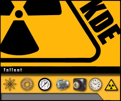
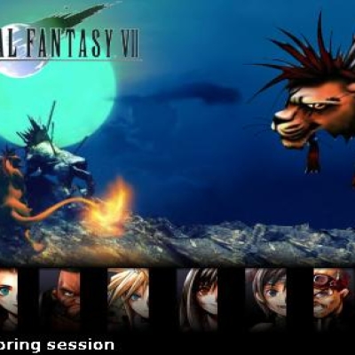
Description: Well, at the request of luci, I have replaced the gears from the hornet splash with my nuclear fallout symbol. You have to love vector art! It's so much nicer for making changes to the splash screens. If anyone else has suggestions, please don't hesitate to ask. I probably cannot do them, but there is no harm in asking.
PS: Does anyone know the coordinates for where the icon tiles should be on a splash? I've just guessed by analyzing some other splash screens, but it would be handy if I knew exactle where it cuts off. Thanks! Also, how do I learn about making IeWM window decorations. I think a hornet/fallout window decoration would be cool.Last changelog:
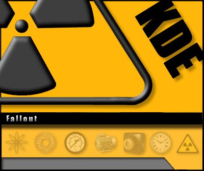
March 31, 2002 --Added version with a non 3D look for the top part of the splash at the suggestion of luci. Now the old beveled version is in the zipped folder "nuke" and the new in "nuke2". --Happy Easter!
it's quite easy to make a icewm theme: looking into the theme directory, you can find framexxx.xpm files where:
- the first x is A (selected window) or I (others windows)
- the second x means B(ottom) , L(eft) , T(op) , R(ight) and M(iddle).
There are too the restore, maximize and close xpms for the buttons and the xpms for the title.
You can play around with that and with the default.theme file. If you have questions about making a theme, feel free to e-mail me.
BTW I like this splashscreen.
Thank you also for the helpful advice on the iceWM themes. I would like to make a color scheme, wallpaper and IceWM with the same bold flavor as the nuclear splash.
but (i always have the "but" :o)) i think there was actually no need to add the bevel and to change the radioactive sign position and the "KDE" appearance
(anyway you can be sure i voted good ;))
I know there has to be something better I can do with this splash. I know, the colors are very loud, but sometimes we can all be in very "loud" sorts of moods can we not? Since everything on here is done on different vector layers, it's really easy for me to change anything. I also have the pre-filtered images too, so I could use different filters (I was thinking about killing the bevel on the fallout symbol or using some other 3D effect for the KDE text). Just let me know~


Ratings & Comments
5 Comments
it's quite easy to make a icewm theme: looking into the theme directory, you can find framexxx.xpm files where: - the first x is A (selected window) or I (others windows) - the second x means B(ottom) , L(eft) , T(op) , R(ight) and M(iddle). There are too the restore, maximize and close xpms for the buttons and the xpms for the title. You can play around with that and with the default.theme file. If you have questions about making a theme, feel free to e-mail me. BTW I like this splashscreen.
Thank you also for the helpful advice on the iceWM themes. I would like to make a color scheme, wallpaper and IceWM with the same bold flavor as the nuclear splash.
but (i always have the "but" :o)) i think there was actually no need to add the bevel and to change the radioactive sign position and the "KDE" appearance (anyway you can be sure i voted good ;))
I know there has to be something better I can do with this splash. I know, the colors are very loud, but sometimes we can all be in very "loud" sorts of moods can we not? Since everything on here is done on different vector layers, it's really easy for me to change anything. I also have the pre-filtered images too, so I could use different filters (I was thinking about killing the bevel on the fallout symbol or using some other 3D effect for the KDE text). Just let me know~
(with me) just remove the bevel (it's not fine) ;)