


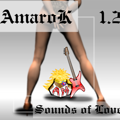
Am-a-roK Star Rock album jackets
dadeisvenm


Source (link to git-repo or to original if based on someone elses unmodified work):
04/22/04
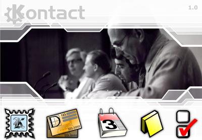
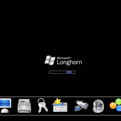
Default Kontact Splash screen icons
04/22/04
New PIM Icons.
04/19/04
Changed PIM images to icons.
added links to various versions http://www.geocities.com/venom3dinc/OFFICE/PROJECTS/kontact_splash/multi-samples/index.html
visit, pick one, and I'll that version the main entry.


More KDE 3.x Splash Screens from dadeisvenm:
Other KDE 3.x Splash Screens:


Ratings & Comments
15 Comments
I think your work on the slash screen is the best overall so far. Nice Kontact logo, nice splash, nice icons. Creative, professional, really, nice job. However, the splash screen has to "match" the application style, and there are other splash screens that do this better. The main issue here are the icons. The "simple" ones fit better then the photographic ones, but even better would be to use a more "comics" style, like the KDE styleguide recommends or even some crystal or nuovola work. PS. Are the images distributable under the (L)GPL?
I see what you mean and I'll make the adjustments soon. the photos are free stock photographs. The only stipulations are to not misuse use the photos (messages of hate, discrimination , etc...) and to contact the photographer. I got the photos from a great site. http://www.sxc.hu/index.phtml just brilliant work on that site. I must have spent 2 days browsing the site for the right photos.
Hey, very nice work... and the slash_top.png I like most is th 3rd screenshot. This Is a competition for splash screens at work so I think I the 3rd one goes best. By the way, your icons look very clean and professional now.( You should make an iconset, they are really nice;-) ) Maybe I'll also participate at the cometition, but I wish you good luck because I think the best should win and at the moment I like your splashscreen most. Bye the way the others aren't also so bad, they look good. Ok looking at all, I can say this is very amzing work ! ;-)
Danke und hallo I really appreciate you comment. :-) Funny you should mention, but I am working on a icon set. :-) The theme is "Home Office"". It will include non traditional folder icons and device icons. The file types and mime types will include M$, Apple, and Linux known files. I will be posting it with, God willing, the full complement of types maybe 300 to 500+. I have a set I like sofar but I won't post till I have what I feel is a good complement of icons. Also I should have 1 more "Kontact Slash Screen" entries by the deadline. ;-)
Das finde ich gut, Nice, because I really like your iconset! And it is very good that somebody is working on an iconset including all icons needed, because there are many sets that aren'tready and have many missing icons.
I like it!
I think it would be PERFECT if you changes icons. I mean that those icons spoil the "profesional look" you gave to the picture. Apart from this, very nice work.
but try an other font for Kontact ...
Thanx ... I know what you mean. I need a font lister for linux to really help me out. I used to use a M$ win. app called "fontlister" but I can't find a linux equivalent that I like.
I actually saw that app in the days of my M$ conversion :-) but It doesn't do everything I want it to do. I bit the bullet and decided to try and Install FontLister 3.X under crossover office. I very shameful to admit the it worked. I guess I should have known that :-D anyways I got what I wanted and I played with a few font and this one seems to fit.
All you need to do is open Konqueror, type "fonts:/" in the address bar, then go to either "System" or "Personal"... most of my fonts can be found in "fonts:/System/truetype/". In your menu set "View>View Mode>Icon View". Konqueror will make thumbnails that show examples of the font. Mouseover gives more detail. Finally double clicking gives a preview of the entire set.
Thanks thats a useful feature of KDE to know. Fontlister works a little bit better however. In Fontlister I can import a sample text (a txt file) and quickly see the outcome by selecting one, multipule or all installed fonts. It also has a good printing option and export as bmp option. As long as it works in wine its all gravy to me. :-)
Nice exept the reflection of the photograph...
Thanks for commenting. I'm still playing around with other images though... :-)