


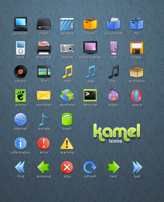
This is my first icon theme for Gnome.
Current release is still developing version, so the icon set is not complete.
So, download it and test

All the comments and suggestions please send on my e-maill, or write on my blog ( http://krupski.linux.pl/?p=111 ).


Ratings & Comments
51 Comments
i am new to ubuntu- i really like this theme. the only problem is that i can only see it in root and not my user profile. any suggestions?
Looks great over dark colors. Hope it'll be completed soon.
Have been using it since I first saw it put up on here. Since then I've modified it a little to make it feel a little more complete, but it still doesn't feel right. I hope that it's eventually finished.
I really love this set, I wish it would be completed.
I'd love it if the set was actually finished. What happened to the creator?
He got the exhausting but well paid job - this is the optimistic version :)
Creator this icons does not have time currently. Sometime it can... :-)
Funny, positive, cartoon-like icon theme. The icons differ from each other and this is a handmade set, each icon is carefully drawn. It makes the user happy and cheerful. Thanks!
I love these icons! They are clean and bright! Thank you for providing them!
very nice theme. keep up the good work. hope to keep seeing updates.
By far the most innovative icon set. Confident use of high contrast and pixel-perfect results. No distribution has contacted you yet?!
Thank you, this are pretty good icons, maybe you could do some more... Exaile, Firefox, Thunderbird, console, log out... lol
how to install these icon?
Use appearance properties in Preferences menu or you can untar it and pu it into ~/.icons/
It's been a while since I've seen something other than "areo" or "apple" icons, I just like building my own theme, not emulate other operation systems... Good work, I'd Like to see more! ^_^
this is a really great icon theme! i love it.
I find this theme quite nice, except the "directory" icon which makes me think of an archive (quite annoying since it's the most commonly viewed icon...)
Agreed. My home folder is full of, mostly, folders and archives. All that separates them at a glance is color. This is my 2nd favorite icon set next to NuoveXT, and aside from that little quirk it's my favorite. Makes a GREAT counterpoint to the Moomex Ultimatum theme with some tweaked colors.
Love them actual using
These look great man! I knew I would use them the second I saw the screenshot.
Man this icon set is the coolest thing I 've seen.Thank you very much!Hope you don't mind me using it on a live cd I'm making...
Good Work Thanks for sharing
Hello, thanks for making a 0.2 release today! I just wanted to say that your package has a bug, an icon theme folder name must not contain spaces. Doing this will fix the problem: jeff@kaname:~/.icons$ mv Kamel\ alpha\ 0.2/ kamel So, your package should contain ONLY a directory named "kamel" with the index.theme and the "scalable" subdirectories. That way, it will be handled properly by the gnome appearance manager.
Thanks for your suggestion. Corrected! ;)
actually, I was also suggesting to not have an archive inside another archive... Is the readme that important (since you can put those infos here or on your page)? If you only provided kamel.tar.gz (the one that is inside the current archive you distribute), users could just "drag and drop" in the theme/appearance window (or use the "install" button).