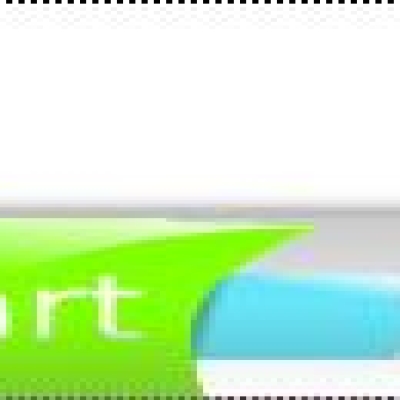
I don't think it's ugly .. well the text doesn't fit quite well into the button though .. the "tart" is not horizontally aligned with "S". Also, text color may need to be a lil more contrast to its background .. But that's my preference :p. YMMV
...i know why its not such as pretty as it could be!
i think its a way to "plastic"...you know what i mean? its too bumpi or so...i more like this kind of flat but clean and detailful things ;)
never mind - its good for kids or youngtimers *hide*
and not very ugly either.
I would not want this on my desktop but it does have some potential... find a way to make the text balanced/more symetrical, use the orange as a sort of highlight, break the orange into two vertical bars at both ends of the button. etc? etc?
Dear author,
I have voted for "bad", too. I am sorry, but drawing is too unfinished. Font of text does not fit to whole button. And orange area is too big. Also maybe you should try to change colors a bit.
But head up. Not everything is loosen. If you will try, i truly belive that you will improve button and that it will gat better rank and better feedback.
Also, where i can see windblows hack you mentioned?


Ratings & Comments
7 Comments
I don't think it's ugly .. well the text doesn't fit quite well into the button though .. the "tart" is not horizontally aligned with "S". Also, text color may need to be a lil more contrast to its background .. But that's my preference :p. YMMV
...i know why its not such as pretty as it could be! i think its a way to "plastic"...you know what i mean? its too bumpi or so...i more like this kind of flat but clean and detailful things ;) never mind - its good for kids or youngtimers *hide*
and not very ugly either. I would not want this on my desktop but it does have some potential... find a way to make the text balanced/more symetrical, use the orange as a sort of highlight, break the orange into two vertical bars at both ends of the button. etc? etc?
I gave a negative rating because it's pretty ugly, just my opinion however. If anyone else gave a negative rating please post why.
Sorry to hear that you don't like it. i'll ty to make some more that look better.
Dear author, I have voted for "bad", too. I am sorry, but drawing is too unfinished. Font of text does not fit to whole button. And orange area is too big. Also maybe you should try to change colors a bit. But head up. Not everything is loosen. If you will try, i truly belive that you will improve button and that it will gat better rank and better feedback. Also, where i can see windblows hack you mentioned?
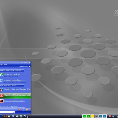
Here's Windowblinds http://www.stardock.com/products/windowblinds/ And here's a link to the theme I got this from http://www.wincustomize.com/ViewSkin.aspx?SID=1&SkinID=3287&LibID=1