Main ideas for this project are:
- less mouse movements needed
- big icons, like in MacOS's dockbar
- target: advanced user (because of no programs names and description, there are just icons)
How it works?
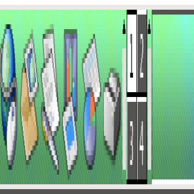
After mouse click in KMenu button two menu bars are showing:
- The inner one include your favorite apps (like the "Favoutites" tab in default KMenu) and the Leave Menu.
- The outer one provide access to apps categories [icon with flowing titles alongside]. When you move your cursor under the icon of each category, the next bars are evolving and show apps from chosen category. Of course sometimes there are more than two levels of menu (e.g. like in the "Utilities" category). This bar also includes Help, Run Command, Find buttons etc.
When the number of menu items grow in each level, icons become smaller [of course maximum and minimum icon size should be defined]. If there will be too much icons you can rotate whole menu up and down.
What do you think about it?
P.S. sorry for my English













Ratings & Comments
11 Comments
Amazing idea. For me i would prefer it to work somewhat similarly to the regular menu bar setup. Click app icon, displays inner ring (apps, places, system) click one of the three, displays next ring (whatever icons would normally be contained within the next sub menu) i would love to use this instead of a dock or standard panel menu thing. Totally rad
I was looking at it and it seems like a great idea, however I noticed that all the categories are inconsistent in location and size. My recommendation would be to generate a single gear layer at first, and allow the gear to rotate as the mouse hovers on the edges. After selecting the category, the second ring would appear with the items contained by the category and behave in a similar fashion
This looks like something that could be prototyped in SuperKaramba. Would anyone like to help with this project? My Python skills are pretty good, my art... Uh, yeah my Python skills are pretty good.
If you make the code, i can help you with the graphical things.
Couple things for consideration: 1) Add a way to search for programs via typing 2) Some apps don't have unique icons, how would this be handled effectively? (So you don't have to sort through a lot of the same icons to figure out which app you want)
I think I'd have to actually try it to know whether I'd like it or not in practice, but the concept sounds awesome.
This is a lot like Kommando... has Kommando been ported to KDE 4 yet?
I would be really nice too if it had an option to auto arrange your icons in the bar by the most used ones going first etc and add a new one if a new app is used frequently etc. :) i really like your idea it look very ergonomic.
good idea it should be default option, another is user-defined sequence. I also think about Recently Used Menu showing when u touch the screen's edge. But then u can't rotate bars. if i place Recently Used only on 1st bar's edge it will be hard to move on it. any ideas?
... this idea would work very good for a smaller set of categories and applications.
This is a very neat idea! I'd be using it for sure.