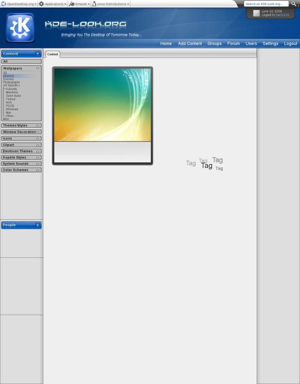
Description: The most recent addition to the mockup with more to go.
----------------------------------------
If you would like to see continued developement for the open desktop web layouts, please donate. It takes a large amount of time to complete just one web layout, time I am rapidly running out of. So if you enjoy this so far, please help support a starving artist.
Great thing I have nothing to throw that into despite of one: maybe change left column color to white? I think it will be much better :)
Or to black (with white fonts) - to compose it with top panel;)
honestly, nice update.
the stuff on top is better but i'd like the cleaner content presentation better.
Especially the navigation on the left is too fuzzy.
Maybe you could remove tis little white dot above the the K on the logo.
greetz joe
I REALLY like the header, its very nice looking. But in the sdeibar, I don't like the borders... what about a treeview similar to the Oxygen style?
just my two cents :)
this design sucks real bad. my eyes hurt after 5 seconds already. the only redeeming qualities are the big preview and the Aesthetics/Functinality rating split.
I see you have changed it to a darker look. Also, what is "ascetics"? Some more suggestions
* Why are the sub menu items indented so much? Reduce the indent a little bit.
* The website name isn't very easy to read. It should stand out. At the moment it is blending in with the background too much.
* What's with the little arrows next to the menu items? It should be pointing right for collapsed and down for when it's expanded.
Aesthetics, sorry for the misspelling. For the arrows I was thinking to have them represent what they do instead of the current state of the category. So if you click a button pointed down, the category will expand, if you click a button pointed up, the category will colapse
I like your mockup, (added my old ones to your group) and especially that taggin thing. I just see the button to add tags, but how about removing tag? Idea would be that users can add/remove tags easily (registered users) and only a one by one. So if someone adds wrong tag or spelled wrong or same thing but with other word, other users can fix it by removing it and placing correct.
Actually there should be a "pool" for tags where users can see what they can add easily (exist ones) and those should be very simple ones, like; Green, Yellow, GNOME, KDE, Glass, Nature, Leaf, Night, Water, etc.
And then there should be easy way to search by using these, not just clickin one of those and see all material what is tagged with that one, but so you can select multiple tags and other metadata what you like to search.
Like first I go to "Search" page, where I add (autocomplete) tags "Green" "KDE" and "Glass" and then I select metadata "1600x1200" and "higher rating than 55%" and "Lower rating than 90%".
Then I would press "Search" and I would get everything what includes all these. (and I would have option to execlude something, like "No yellow" and "No Tux").
I like very much your top bar (Home, Add contect etc) and login information panel on top right corner. And especially I like the "report" button because there are so much stuff what is licensed under GPL, even when it's copyrighted by someone. And we should get ridd of those, so reporting should be easy!
Oh, forget to comment that "bad rating" box. I think that there shouldn't be such box if you give bad rating if there isn't such box when you rate artwork over 60%.
Many user hits very easily the 9-10 on 1-10 scale, but the real counting should always be done by downloads. Like if 50'000 checks your art, but only a 2000 downloads it and all those who downloads it, are only ones who rate it and gives 8-10 points, it gets unfairly a rating over artwork what gets 50'000 checks and 25'000 downloads but only a 500 rating 6-7.
This is one hard question what's came up on voting groups.
Again, great work!
Sorry,
but in my opinion it is currently just gaudy. Too many gradients and curves. Web 2.0 style is not a must have. But it is nice to see another fresh style. Of course website design is pretty difficult to discuss.
I don't like the black borders, they make the mockup look a bit unprofessional. Try something more subtle, make them 50% transparent or dump them completely on some areas and use just shadows instead. I would also like lighter gradients. Because of those things, the mockup looks a little too heavy for my taste. Otherwise it looks nice, colorscheme is consistent and not too overloaded.
My eyes are bleeding from the high contrast.
What is the big deal with blue? I hate blue color schemes. Blue is everywhere, it is boring to tears. I liked kde-apps.org because it was red.
Make the glass look less extreme. Some elements do not have to cast shadows. Then it seems like a picture taken from badly focused camera.
I found the button shading too extreme too. Why shade it at all?
Do yourself a favor and go use windows 95 if you want flat buttons. Blue has always been the color of KDE. What else could be done but blue? (besides monochrome). Green is Suse, orange/brown is Ubuntu, purple is Gentoo, and red is already used for KDE apps, so all that is really left is blue. This is supposed to be an update for KDE-look to bring it closer to the Oxygen style released in KDE4. For anyone who wants to keep the world in the dark ages of KDE2, this is not the site for you, move on.
I really don't know what you wanted to hear. You said to comment specifically on (among other):
[ ] Poor colorscheme.
[ ] Too much/little contrast.
Just because I didn't like the color scheme makes me dork? Comment == Agree? Why should it? Don't ask for comments next time!
To complement my last comment, I liked the rating system, the increased preview area, and tagging.
That was not in reference to the mockup. That was a poor attempt to show what the dialog would look like if a user got rated work rated below 40%. (I did not have a mockup finished for that yet). So the idea is that if a user rates below 40% on a work, that is what the user will see.


Ratings & Comments
34 Comments
We need this! :D
Nice .. but looks like wwww.crystalxp.net
didn't you want to post more mockups?
Great thing I have nothing to throw that into despite of one: maybe change left column color to white? I think it will be much better :) Or to black (with white fonts) - to compose it with top panel;)
honestly, nice update. the stuff on top is better but i'd like the cleaner content presentation better. Especially the navigation on the left is too fuzzy. Maybe you could remove tis little white dot above the the K on the logo. greetz joe
alright, I will remove the dot over the K and try to re-do the side bar to look more like the oxygen tree.
I REALLY like the header, its very nice looking. But in the sdeibar, I don't like the borders... what about a treeview similar to the Oxygen style? just my two cents :)
hello all i love the look its very clean. not sure how to edit php sites also it may need to be re written to separate images and distro art.
Make mockup where you have reduced the size of banner (kde-logo etc) 50%.
I second that.
Me too.
this design sucks real bad. my eyes hurt after 5 seconds already. the only redeeming qualities are the big preview and the Aesthetics/Functinality rating split.
I see you have changed it to a darker look. Also, what is "ascetics"? Some more suggestions * Why are the sub menu items indented so much? Reduce the indent a little bit. * The website name isn't very easy to read. It should stand out. At the moment it is blending in with the background too much. * What's with the little arrows next to the menu items? It should be pointing right for collapsed and down for when it's expanded.
Aesthetics, sorry for the misspelling. For the arrows I was thinking to have them represent what they do instead of the current state of the category. So if you click a button pointed down, the category will expand, if you click a button pointed up, the category will colapse
I like your mockup, (added my old ones to your group) and especially that taggin thing. I just see the button to add tags, but how about removing tag? Idea would be that users can add/remove tags easily (registered users) and only a one by one. So if someone adds wrong tag or spelled wrong or same thing but with other word, other users can fix it by removing it and placing correct. Actually there should be a "pool" for tags where users can see what they can add easily (exist ones) and those should be very simple ones, like; Green, Yellow, GNOME, KDE, Glass, Nature, Leaf, Night, Water, etc. And then there should be easy way to search by using these, not just clickin one of those and see all material what is tagged with that one, but so you can select multiple tags and other metadata what you like to search. Like first I go to "Search" page, where I add (autocomplete) tags "Green" "KDE" and "Glass" and then I select metadata "1600x1200" and "higher rating than 55%" and "Lower rating than 90%". Then I would press "Search" and I would get everything what includes all these. (and I would have option to execlude something, like "No yellow" and "No Tux"). I like very much your top bar (Home, Add contect etc) and login information panel on top right corner. And especially I like the "report" button because there are so much stuff what is licensed under GPL, even when it's copyrighted by someone. And we should get ridd of those, so reporting should be easy!
Oh, forget to comment that "bad rating" box. I think that there shouldn't be such box if you give bad rating if there isn't such box when you rate artwork over 60%. Many user hits very easily the 9-10 on 1-10 scale, but the real counting should always be done by downloads. Like if 50'000 checks your art, but only a 2000 downloads it and all those who downloads it, are only ones who rate it and gives 8-10 points, it gets unfairly a rating over artwork what gets 50'000 checks and 25'000 downloads but only a 500 rating 6-7. This is one hard question what's came up on voting groups. Again, great work!
Sorry, but in my opinion it is currently just gaudy. Too many gradients and curves. Web 2.0 style is not a must have. But it is nice to see another fresh style. Of course website design is pretty difficult to discuss.
What would you propose?
I don't like the black borders, they make the mockup look a bit unprofessional. Try something more subtle, make them 50% transparent or dump them completely on some areas and use just shadows instead. I would also like lighter gradients. Because of those things, the mockup looks a little too heavy for my taste. Otherwise it looks nice, colorscheme is consistent and not too overloaded.
Thanks for the feedback! I will keep this in mind for the next update.
i like it like it is. Nice red Color, don't bring up eyebleeding and not big glossy somtehing. It is KISS and i like simple designs. Seraphyn
My eyes are bleeding from the high contrast. What is the big deal with blue? I hate blue color schemes. Blue is everywhere, it is boring to tears. I liked kde-apps.org because it was red. Make the glass look less extreme. Some elements do not have to cast shadows. Then it seems like a picture taken from badly focused camera. I found the button shading too extreme too. Why shade it at all?
Do yourself a favor and go use windows 95 if you want flat buttons. Blue has always been the color of KDE. What else could be done but blue? (besides monochrome). Green is Suse, orange/brown is Ubuntu, purple is Gentoo, and red is already used for KDE apps, so all that is really left is blue. This is supposed to be an update for KDE-look to bring it closer to the Oxygen style released in KDE4. For anyone who wants to keep the world in the dark ages of KDE2, this is not the site for you, move on.
I really don't know what you wanted to hear. You said to comment specifically on (among other): [ ] Poor colorscheme. [ ] Too much/little contrast. Just because I didn't like the color scheme makes me dork? Comment == Agree? Why should it? Don't ask for comments next time! To complement my last comment, I liked the rating system, the increased preview area, and tagging.
That was not in reference to the mockup. That was a poor attempt to show what the dialog would look like if a user got rated work rated below 40%. (I did not have a mockup finished for that yet). So the idea is that if a user rates below 40% on a work, that is what the user will see.