.. but I got some issues with this:
- music-applet and fast-user-switcher-applet (GNOME panel) does not take the color of the theme
- text color in the menu (e.g. the "Applications" menu) is too dark I think
- hover effect for the window list would be nice
I previously used the Linista theme, but after reinstalling Ubuntu onto a new machine I thought I'd give this a try, and I find it much nicer to look at!
I'd loved your theme, but the dropdown menu is annoying, hope you fix it and keep up the good job :D
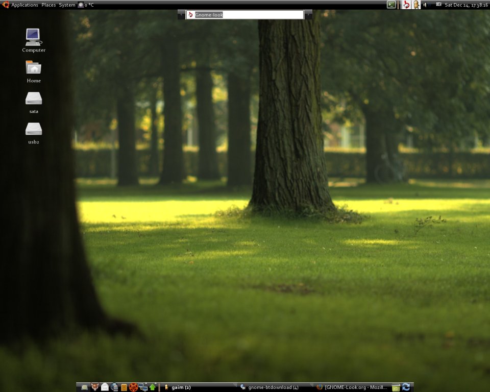
Another thing, do you have the wallpaper you're using in 1200x720?
Cheers
i like the idea
standard light colors so that no apps get messed up with the completely dark theme yet dark menus and panel
but there are some issues that you should change
http://pub.insanity.in/img/scrshot/2007-07-22-170846_1280x1024_scrot.png
1. the panel - see on the screenshot there are problem with widgets that are on the panel, they get a light background
that should be dark too!
2. the panel again - opened apps shown in the task bar have a way to dark font so the text is practically not visible
3. drop down menus - same problem, text not really visible unless selected
except for those issues the theme looks simple yet functional :)
First off.. lovely theme!
For some reason the inside of my window menus dont reflect the theme. For example the menu bar (File, Edit, View, etc..) of my applications are still grey.
Am I missing anything?
I love this theme. It's beautiful. However, some real problems have come to the fore once I've started using it.
One: Not high enough contrast on menus. Dark grey on black makes for a headache and a lot of squinting.
Two: On a couple of menus (I'm trying to find which ones, but I'm having trouble) they're completely unreadable. instead of the grey background (which looks great), it's just the curved bar over and over, and you can't read anything at all.
hi!
can anyone help me? i've updated my ubuntu from dapper drake to edgy... the tasks in the tastklist (in edgy eft) are now with white background and i cant read the text in the tasklist... bug? thank you an kind regards!!!
I'm having the same problem. This theme is absolutely wonderful except that the taskbar items are washed out. Both the background and the text are heavily tinted white.
I don't see this problem in the screenshots, so any help would be appreciated.


Ratings & Comments
64 Comments
this is a generic theme not ubuntu deb package
I found a bug that makes launcher property dialog boxes pattern with the title bar instead of show a normal window background. http://i119.photobucket.com/albums/o147/kingofgoldoa/Screenshot.png
there have been some comments over the months on this theme about the contrast issues and the menu backgrounds. I made some slight mods to fix this, which works for me on Ubuntu 8.10. Feel free to help yourself to it at http://www.davisononline.org/nontechnical/6-home/15-gtk-dark-theme-mod.html
how did you get the applications menu to be glossy? My applications menu is simply black :( my fast-user-switch applet also.. dracayr
.. but I got some issues with this: - music-applet and fast-user-switcher-applet (GNOME panel) does not take the color of the theme - text color in the menu (e.g. the "Applications" menu) is too dark I think - hover effect for the window list would be nice
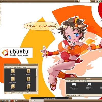
How did you get the bottom panel to be so small? I saw that before but I can't figure it out. Or is it a seperate application?
Ok that was simple. I figured it out.
Works as long as you keep the task bar in its standard location, not designed for the taskbar to be vertical.
Very nice, had one on other machine that was a kinda Vista clone. Can't load onto Hardy, but this brings it to my new machine. Thank you. Nice...
I previously used the Linista theme, but after reinstalling Ubuntu onto a new machine I thought I'd give this a try, and I find it much nicer to look at!
I'd loved your theme, but the dropdown menu is annoying, hope you fix it and keep up the good job :D Another thing, do you have the wallpaper you're using in 1200x720? Cheers
please, can you give a link to the wallpaper background shown in the screenshot?
okay i love the theme but for them menus can you give it a white font so my eyes can rest easily thank you.. (just trying to help :)
But unfortunately I'm not going to use it until the issues mentioned below, regarding text colors in the menus, are fixed.
i like the idea standard light colors so that no apps get messed up with the completely dark theme yet dark menus and panel but there are some issues that you should change http://pub.insanity.in/img/scrshot/2007-07-22-170846_1280x1024_scrot.png 1. the panel - see on the screenshot there are problem with widgets that are on the panel, they get a light background that should be dark too! 2. the panel again - opened apps shown in the task bar have a way to dark font so the text is practically not visible 3. drop down menus - same problem, text not really visible unless selected except for those issues the theme looks simple yet functional :)
Love the theme! Only thing I would suggest is in the menus, switch the colors for the usable and unusable options.
oh and rounded windows would be cool too, but that's no so important to me as the menus.
First off.. lovely theme! For some reason the inside of my window menus dont reflect the theme. For example the menu bar (File, Edit, View, etc..) of my applications are still grey. Am I missing anything?
When I try to view and launcher properties I get this: http://img357.imageshack.us/my.php?image=screenshotwt9.png
I get this too. Is there a fix, or are you working on the solution still?
This problem still exists. Any ideas? Reupped an image of the problem: http://img56.imageshack.us/img56/5447/darkerbe4.png
I love this theme. It's beautiful. However, some real problems have come to the fore once I've started using it. One: Not high enough contrast on menus. Dark grey on black makes for a headache and a lot of squinting. Two: On a couple of menus (I'm trying to find which ones, but I'm having trouble) they're completely unreadable. instead of the grey background (which looks great), it's just the curved bar over and over, and you can't read anything at all.
hi! can anyone help me? i've updated my ubuntu from dapper drake to edgy... the tasks in the tastklist (in edgy eft) are now with white background and i cant read the text in the tasklist... bug? thank you an kind regards!!!
I'm having the same problem. This theme is absolutely wonderful except that the taskbar items are washed out. Both the background and the text are heavily tinted white. I don't see this problem in the screenshots, so any help would be appreciated.
I have the same problem. Help!