


LumeCo
simone84


Source (link to git-repo or to original if based on someone elses unmodified work):
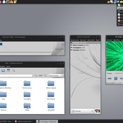
Version 0.4:
-Cange Colours
-increase the icons linked with "gtk-large-toolbar"
-more deep aspect to pushed buttons
Version 0.6
-Introducing emerald theme
-Wallpaper (1280x800) with transparency for "auto-choose" background color
-Add in gtkrc the pidgin theme
-Adjoust color on combobox
-Change tooltip color


More GTK2 Themes from simone84:
Other GTK2 Themes:


Ratings & Comments
14 Comments
I find a solution : in ~/.themes/Wodac/gtk2/gtkrc with gedit I'v change indicator-size from 8 to 12 # radio button GtkRadioButton::indicator-size = 12 # -modificato: era disattivato default=15 = 12 # -modificato: era disattivato default=15 now it's ok in firefox
I love your job ! very pretty but I've a problem with firefox 3 on ubuntu look at this image of botoms http://www.hiboox.fr/go/images/divers/capture,4e5c539ed3c7aa764e898fae5c17ab43.png.html the others aurora theme don't do that....
Web 2 style no!
Its realy realy nice and perfect this theme.Good job!!!!
Yeah, blue one looks much better I think. By the way, what do you think about green tones? For example: http://www.picamatic.com/view/3101997_4/
1've created the same theme with 4 different colors,but I think that someone won't like these combinations.fortunately with Gnome you can easily change the colors scheme,so my main goal is the visual consistence of the theme. for example I have problem with gnome control center e with icons and I hope to solve them.obviously if you have suggestions on how to solve these problems I will be very thankful!!! :)
I like the theme over all, but I wonder if the diagonal stripes could be toned down a bit. Otherwise, great job!
liked it very much! thanks.
you did a really good job! congrats
Wow, this is a very interesting theme. I like it.
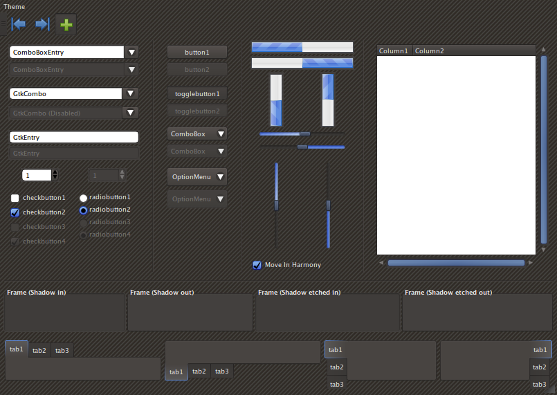
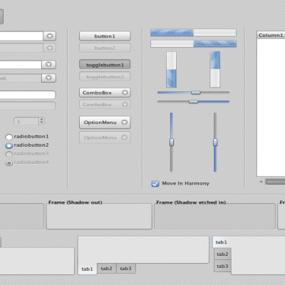
I think i will introduce new colors, similar to those used by "Gnome-color" icon theme (green-blue-orange-violet). I will try to give a more deep aspect to pushed buttons, moreover i will correct some graphic mistakes (such as in control panel). I'd like to grow the icons linked with "gtk-large-toolbar", bring them to a 24x24 misure instead of 16x16. I'm shill working on the same theme with light colours. I'm introducing others different colours (except to scrollbars that in my opinion are better with gray tonality). If you have some other ideas please write to me. :)
Yes, I think this theme to be really great but you'd better change the colour from pink to something more traditional, like green or blue.
I agree. Great theme though for the rest.
I think this theme is a wonderful idea! I love it! Definitely rated, "Good"! Is it easy to change the color theme? Or, could please release a green and blue (light and dark are both desired) version, too? Once again, wonderful job! Can't wait to see it in other colors and its continuation.