

Gela
golan


Source (link to git-repo or to original if based on someone elses unmodified work):
-Small fixes for panel (Humanity)
-Add gtk code for small resolution screen. Change button's in metacity.
-Ghanged text-color of the Humanity-DP.
-Added Humanity-DP(dark panel) theme. Best with Humanity-Dark icons.
-Delete aurora-engine from humanity theme. Now the theme is based on murrine-engine. Changed the color design theme, now it has become softer
Style theme is clean, nothing more.
-Humanity-shokolad theme (old version)


More GTK2 Themes from golan:
Other GTK2 Themes:


Ratings & Comments
39 Comments
Could you say, what kind of dock you're use and what theme of this dock (if this theme not default) Sorry me for my bad english
It's Docky from elementary desktop https://launchpad.net/docky Here is repo: https://launchpad.net/~docky-core/+archive/ppa
Thank you very much :)
Hello, first, I would like to thank you for your work, I find it great. It makes me love Linux more and more ;-) I only have a problem with "sudo applications", wich look like "Wine applications" as you can see on this picture : http://www.chokicho.fr/share/humanity_sudoappli.png, and I don't know why. If womeone got the same problem... Best wishes from France
In terminal: sudo ln -s ~/.themes /root Are you happy now?
Thank's for your comment.
Just as simple as that ? ;-) Thanks !
For icons: sudo ln -s ~/.icons /root
Hello, first, I would like to thank you for your work, I find it great. It makes me love Linux more and more ;-) I only have a problem with "sudo applications", wich look like "Wine applications" as you can see on this picture : http://www.chokicho.fr/share/humanity_sudoappli.png, and I don't know why. If womeone got the same problem... Best wishes from France
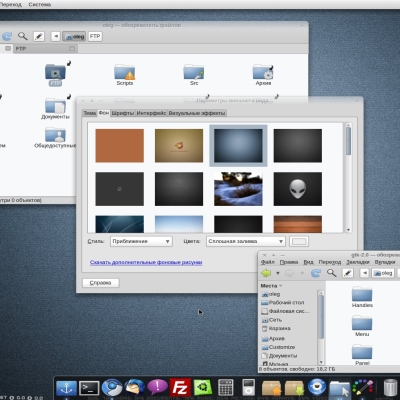
Что за тема Хрома на скрине? [What Chromium theme is on the 1st screenshot?]
This is a default and using GTK (the - look - use the theme GTK)
Ok, thank you
Nautilus looks much neater now, the places menu on the left looks much easier to read and the current tab now matches the bg of the main file browser I do think the borders on to toolbar look a little strong but I might get used to it.
... but try to make the metacity even better. For example the right corner on the top (circle) is bad. The left side is okay.
Metacity ... if the window is maximized and you want restore, so a "+" isn't the best symbol. Maybe a ">" showing down would be better. ;) Pushed Buttons are very blurred. Maybe you can try to improve ... :)
..new colorscheme, love the brown colors, thank you very much kind regards MikeDK
I really like this theme. My only request would be to add a dark menu option that are similar to the Shiki menus. Then it would be just about perfect! Thanks.
The theme manager says that I need Aurora but seems to work ok without it. It that a bug or does it actually require Aurora? Sorry, don't have time to install Aurora to check. Thanks
Yes, take it from here: http://www.box.net/shared/yqz6dk27fp
Wow, thanks for the deb! Unfortunately I am using the 64-bit version of Ubuntu so it doesn't work. Do you by any chance know where I can get a 64-bit deb? I've never had much success trying to compile it myself.
Take it from here http://www.gnome-look.org/content/show.php/Aurora+Gtk2+Engine+para+Debian?content=99846
Nice job but...why not change the light color of the text with a darker one?I think that makes words more readable with light orange....I give you a screenshot of what i have in mind... http://img8.imageshack.us/img8/7512/immaginelg.png PS:I really like the new metacity theme!
Sorry, I don't understand what are you talking about... Your screenshot have a places menu only
Okey, I understand.
Great!:)