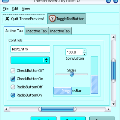
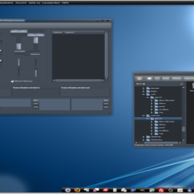
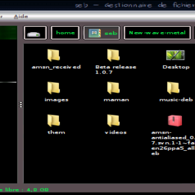
Quote from google-code "ECSTATiCA is a gnome styling project. It will give your gnome desktop a darker look, and some other goodies as well. Colors will be based on the tango palette, with little or more modification."
I would like to say thanks for all the comments and suggestions =)
For now, please use the project page at: http://code.google.com/p/ecstatica/
If you care, please leave a comment about what you'd like to improve or change, its appreciated!
You can also use the issue tracker on the google-code page.
Everyone who help ECSTATiCA move forward in this way will of course be credited when its time for release.
// Estrayk
* Notable changes (rev 22) *
Notebooks back to Murrine!
Scrollbars, colored sliders and better contrast.
Scales, better contrast.
Treeviews, new gradients and selection colors.
Menubar, now striped look. *edit*
GNOME Panel, menu applet bg fixed.
Emerald theme used in scrnshot #1 is "Minimal" by Andreas Heider.
OLD DESCRIPTION
A gtk+ theme powered by Murrine (naturally) with a soft dark touch, named the same as one of my favorite PC Adventure/RPG games NOX.
----------------------------------------
Enjoy


Ratings & Comments
38 Comments
Claws-mail did for some reason use the fg-colour in place of the text colour. The following solves that: widget_class "*<GtkCMCTree>*" style "FIX__FG_IS_TEXT_COLOR"
To clarify: add that line to the end of NOX/gtk-2.0/gtkrc to fix the color of folder text in Claws-Mail. This was a big help for me.
Love this theme, but almost had to give it up without this work-around. Thanks a lot, works great!
Hi there, This is my favourite theme, thank you so much. I do have a small problem though - when I use this theme my play/pause icons are pushed off-center in Rhythmbox with the result that the right hand side of the icons are cropped. See a screenshot here: http://www.mediafire.com/?zjnjhmadqd2 This happens with all icon sets, including standard "Gnome" etc. I do not have a problem with other Murrine based themes, only this one. Your theme seems to increase the size of everything within windows, for example using Nox I can see, say, 9 rows of text in the Rhythmbox playlist, whereas if I switch to another theme I can see 10 rows. The same thing is happening with the icons, but because the first column in Rhythmbox is fixed width the icon gets cropped. Thanks, I hope you can tell me how I might be able to fix this.
When I use this theme, it overrode the font I specified in my ~/.gtkrc-2.0 file. This should be changed so the user can pick the font and size THEY want.
There is an inconsistency between the notify popups for Sonata and cgmail. These are two distinct types of notifications: the first one just shows a transient notification (status information), while the second shows notifications that have a visible countdown before they disappear (message information). Here's a screenshot comparing the two types. They both occur when I am using this theme. http://members.shaw.ca/fyda/20090806_gtk_nox_libnotify_unreadable.png The black text on yellow background clashes with the rest of the theme and I doubt it was intentional. The white text on light grey background is unreadable on some screens. Ideally the colours would be black text on a light grey background. Thanks.
Just thought I'd drop by to tell you this. It's AWESOME :)
Like it very much but I can't find a Xfwm theme that match it. Maybe something like Neutronium but it's too dark. Any suggestions?
This is now the best looking, most functional dark theme I have used. The only other dark theme that I have used that comes close is Wolvix Linux default theme. I am using the Moomex's Metacity border but Shiki-mint-striped and SteelDust look good also, Moomex metacity border does seem a little easier to used for me though. Oh and I am using gTango icon set. Best theme ever!
Then I'm very happy =) Thanks mon!
I like most of the colors but there needs to be more contrast between the scroll bars and sliders against the background colors to increase usability. I wonder if it's possible to get the scroll bars the same color as the progress bars?
Thanks for the comment. I'm currently working on notebooks and (list|tree)views. I'll look into this, soon, for sure =) While you are waiting... You can set the scrollbar to the same color as progressbars with the murrine option "colorize_scrollbar". engine "murrine" { colorize_scrollbar = TRUE }
Scroll bar fix worked wonderfully, I also increased the menu icon sizes up to 26. Some times I don't run all my windows maximized and when the scroll bar stands out more it is of course easier to use, having it the blue shade against the dark grey background really makes it pop out now. I voted up the theme to. Good work and thanks.
All you mentioned has been modified in revision 22, hope it suits your needs. And everyone else too of course. Again thanks for the tip, and rating =)
Thanks for the comment. I'm currently working on notebooks and (list|tree)views. I'll look into this, soon, for sure =) While you are waiting... You can set the scrollbar to the same color as progressbars with the murrine option "colorize_scrollbar". engine "murrine" { colorize_scrollbar = TRUE }
Thanks for the comment. I'm currently working on notebooks and (list|tree)views. I'll look into this, soon, for sure =) While you are waiting... You can set the scrollbar to the same color as progressbars with the murrine option "colorize_scrollbar". engine "murrine" { colorize_scrollbar = TRUE }
bleh, double posts. I'm not able to delete those...
It looks really slick. I love it. I have a little issue though. my main menu applet in the panel has a darker shade than that of the rest of the panel. i've included a screenshot http://dl.getdropbox.com/u/197580/screenshots/nox-screenshot.png is that normal?
Glad you like it! And yes that's normal, I'm gonna take a look at the gnome-panel and style it, maybe with pixmaps, soon.
Its fixed in revision 22, hope you like it!
It looks great. Thank You :)
I really like this theme :) I would just like to tell you that a tab highlight is something you should consider adding to your next release. Right now in Firefox/Nautilus I can't really see what tab is selected. The buttons have the highlight, so I guess it is not that hard to do, it's just I don't know how. Thanks again for this great theme!
Hey, thanks for the tip =) About the tabs. I dont know if you've seen it, but sometimes when you hover your mouse over a (check|radio)button the background color of the (label|text) gets highlighted. Or better, you get a highlighted rectangle around the text. Thats one thing I dont want in this theme. Highlighting the tab background, will give this effect on any (check|radio)button in the tab. I've been working on this and atm I'm stuck with only highlighting the head/button, because I will need to have different styles for every tab->child that is a (check|radio)button. It will work, as long as the application dont use custom widgets :) Maybe a darker background for inactive tabs? I'd like to discuss this further. // estrayk
I'll look into changing the gradients for tabs tomorrow.
A darker background for inactive tabs would be perfect. Didn't think of that at first, but it's a great solution.