

Clear-Europe
danito


Source (link to git-repo or to original if based on someone elses unmodified work):
1.1 fix icon size problem, thanks xanderoby
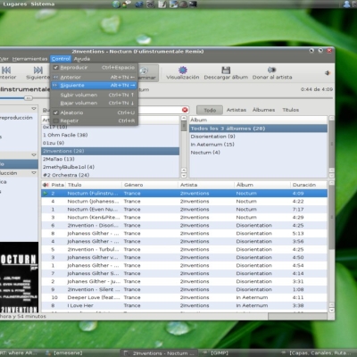
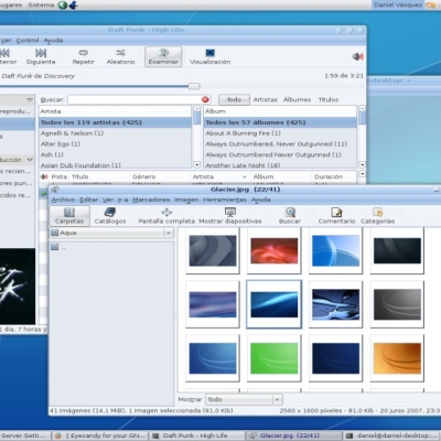
1.0 updates
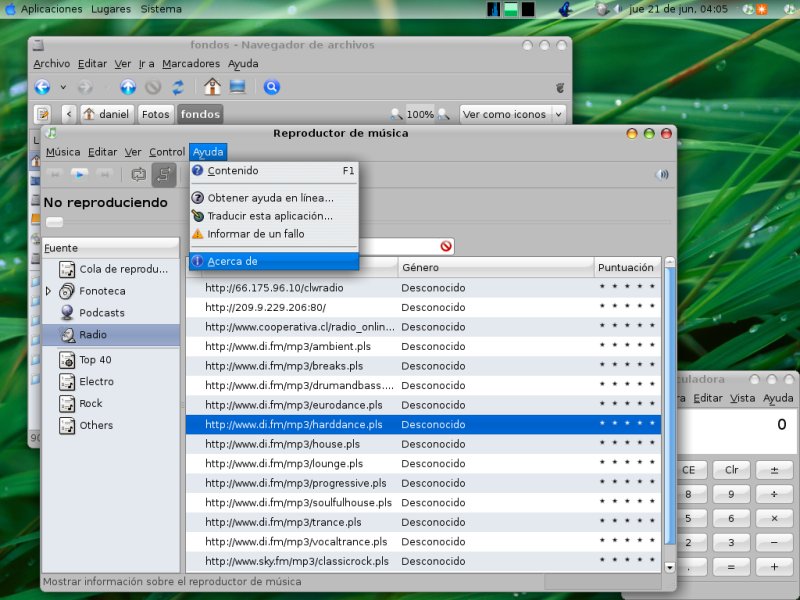
- updated all colors
- new menu items look
- updated icons sizes
- improved buttons, scrollbars & progress bar


More GTK2 Themes from danito:
Other GTK2 Themes:


Ratings & Comments
11 Comments
i really like this theme, and the new look of OS X, but there is one thing that bothers me and keeps me from using this. is it possible to make the buttons look more different when you mouseover them? it makes the interface seem more interactive.
how do i change that apple color or macOS icon on left top corner. and how to change that icon something else
Awesome theme . Btw can you tell me where to add that transparent panel .png to make my panel transparent .. [:O]
for transparent panel right click on the panel -properties- -Background- and select the image
Are your gtkrc inspired by murrina dark² gtkrc? There are one feature & one mistake in common..
yes, it takes some ideas of your theme which is the mistake?
I think isn't difficult write "some ideas by Murrina Dark²".
Problems? remember that the last version of murrine engine is needed http://cimi.netsons.org/pages/murrine/download.php thanks for comments ;-)
I like this theme quite a bit, however I was wondering whether I am the only one who has the following problem. In text-boxes (like the locationbar of Epiphany) the blue lines around them that appear when you focus the text-entry boxes is incomplete. Look at the screenshot for a more concrete view. http://www.jel-lej.dk/temp/Screenshot-1.png How to fix this problem?
Love it! One minor comment: when highlighted, menu listings (menu commands) are not readable, they're just pure white. Any chance you can fix? Thanks again for great work.
Very well done. I like it! Thanks