


Now for the grand explanation (I spent 5 whole minutes on this you know...):
0. KDE2.2.2: it's on a mission-critical debian box. I can wait for deb packages

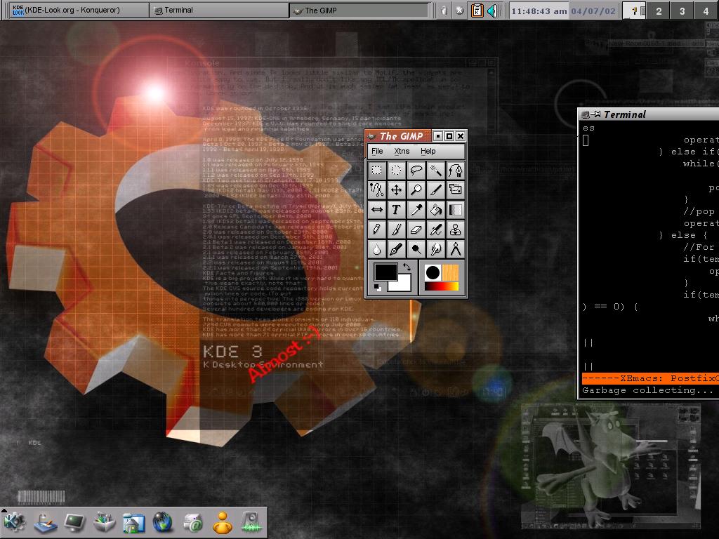
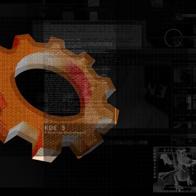
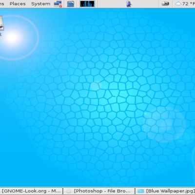
1. Background: it's kde3blue, part of kdeartwork, gimpped up. Nothing special. A few layers, reversed and toyed with the color.
2. Xft: Pretty anti-aliased fonts in GTK and QT. Uses sub-pixel for extra "purtypoints".
3. Panel: Except for my buttons, everything else hides on the child panel in the first shot. With shading, the taskbar is damn near useless.
4. Icons: Slick. Need I say more?
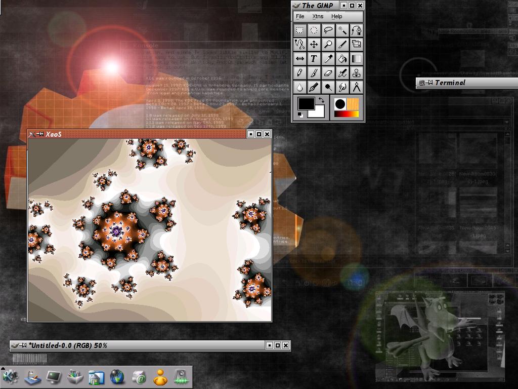
5. Xaos: KDE people like pretty stuff, right???
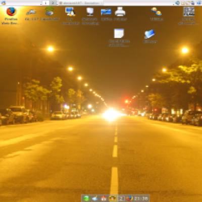
6. The whole she-bang: Lemmie know what you guys think, but is anyone else here tired of blue? As a useful tid-bit, if you like black and orange, reversing the color on any white-blue bg will do that! Happy for us orange-o-maniacs.


Ratings & Comments
2 Comments
Could you make a version in blue? Sorry, sorry, couldn't resist! :oD /me ducks and runs Seriously, though, it does look pretty cool.
Just one problem, please take out the ALmost ;-) KDE 3 was just released and I like pretending I have it.