


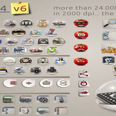
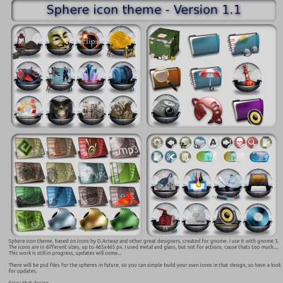
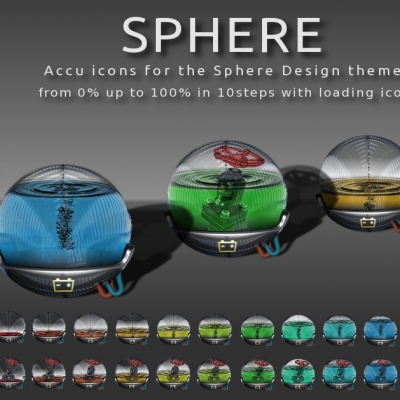
Sphere 1.4
potzblitz7


Source (link to git-repo or to original if based on someone elses unmodified work):
v1 uploaded 06-2013
12-06-2013
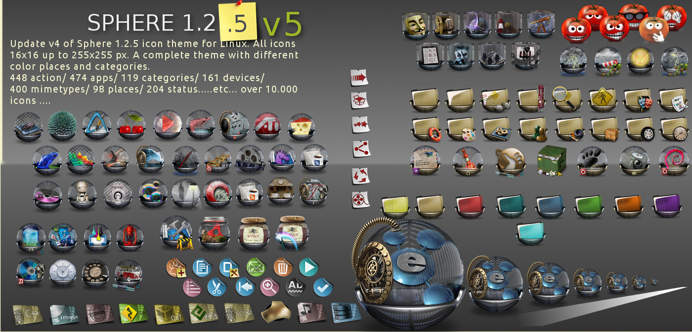
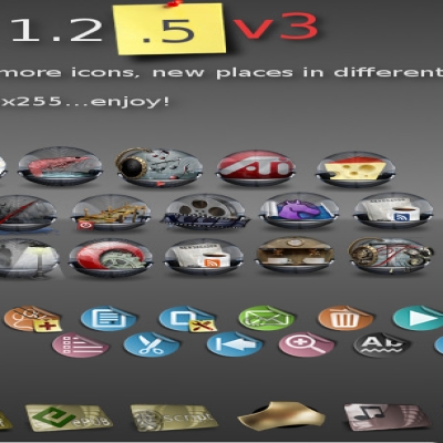
more app icons
more emblem icons
more places icons
2 more colors for places (yellow and light blue)
Newsreader icons
emote icons tomatoe style
16x16 icons are now colored
all icons in 300dpi
fixed some issues
07-2013:
More app icons and actions icons
smartphone icon in devices
07-2013 (v3)
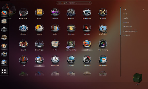
I added the new VITRUM design (sreenshot 3) with the categorie folder. The old folder with round glasses is named as categories-round. If you like this more, just change the folders and rename it.
07-2013 (v4)
added some new app icons, change the wine icons and added the new skype icons
08-2013 (v5)
fixed the problem with google chrome browser - the icons are no longer cut off
added some new icons in apps
28-05-2013
There is an ppa at this link:
http://www.noobslab.com/2013/05/sphere-icons-for-ubuntu.html


More Full Icon Themes from potzblitz7:
Other Full Icon Themes:


Ratings & Comments
14 Comments
Just to show you how much I appreciate your hard work. http://youtu.be/3bwpNUoB3wU
This is definitely the best gnome icon theme. The second best theme being version 1.3 of this theme. Would it be possibly for you to add an "empty" globe ? If so, I'd be forever grateful. I have a few applications that I'm pretty much the only person on earth using, and I'd like to trap them in an awesome globe :)
jedoch finde ich es etwas zu dunkel.
Inwiefern zu dunkel? Was für ein Thema nutzt du? Ich benutze den "Standard" Hintergrund von Ubuntu und das Thema MediterraneanNight in grau. Da ist der Kontrast und die Ausleuchtung der icons sehr gut. Vielleicht kann ich versuchen, dafür eine Lösung zu finden....
Ich nutze das Greybird-Theme. Da haut das mit dem Kontrast nicht ganz so gut hin. Denke, dass das Theme 1 oder 2 Nuancen zu dunkel ist. Vielleicht als Light-Version anbieten oder so. <-- Vorschlag nur, weil ich nicht im Geringsten über den Aufwand Bescheid weiß, der nötig ist um ein Theme zu erstellen.
Ich nutze das Greybird-Theme. Da haut das mit dem Kontrast nicht ganz so gut hin. Denke, dass das Theme 1 oder 2 Nuancen zu dunkel ist. Vielleicht als Light-Version anbieten oder so. <-- Vorschlag nur, weil ich nicht im Geringsten über den Aufwand Bescheid weiß, der nötig ist um ein Theme zu erstellen.
Internet pleasing in that it allows ordinary people to meet interesting people. Powerful icons! RESPECT!!!
Of course, we support you. On duty, I can not always be near my husband, but online we can support each other always. Give people the beauty, it is given to you from above!
Thanks for the praise. I will continue to use my creativity to the project. It currently provides many rectangular icons, all inspired by the Apple design. OK, that looks good, is practical. It's all the same to me, too simplistic. I have a PC with high performance, a good monitor, why should not I use icons and graphical quality? I want to belittle the work of others so that not, these are great inspirations and absolutely great. But I like a different design, something as contrast to the rectangular. So I'll try to improve the design of more and more and to complete.
A true artist is always a trendsetter. You have opened a whole new trend in the design of icons and you have supported and will support. Your icon sets have a fairly large amount, but for the fact they have a major advantage: they have artistic value and they are working on many operating systems. If you are object to follow, then you stand for something. My wife and I thank you for your contribution to improving the interface of OS kernel-based Linux. The first set of icons that I installed Ubuntu, it was your set of icons Slipper. Having established a set of icons, I felt like a boat on the sea. I and my wife always got you covered. Thank you for your response.
I will support my colleague. A drop of each work creates real creativity. It is important to organize work and to sustain the work of the same style. You are very good at it. You are doing a lot in the development of free software. Good luck!
Your work is a real work of art. Your creativity is the source of my inspiration and motivation to work. For true connoisseurs of art is an example of your work. Your works are the inspiration for the creation of new works and the main base for other developers. Honest and original approach always leads to success. Thank you for all that you do.
Excellent set of icons. Circles are a nice break from the many square themes. In Chromium (using Mint 15/Cinnamon & Gnome-Cupertino-Mint GTK Theme) the tops and bottoms of the icons are cut off on the buttons. Anything that can be done about that? Also, how about an icon for Liferea and other newsreaders?
Thank you.. Iam working on icons for newsreaders. They will come in the next update (liferea, pan and knote). For the problem with the action buttons in chromium... i am using firefox, but i will take a look. In firefox, they are working fine...