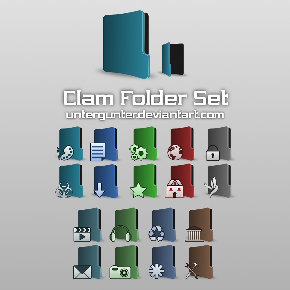
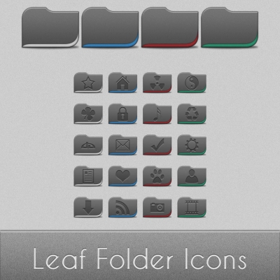
Description: This is my first try on icon designing, it was a hard work and obviously a good learning experience. As you can see in the preview there are 9 different colors and 21 icons 128x128 px (one not in the preview image)... Hope you like it! Thanks in advance for comments and feedbacks!
Not bad at all, it's a good start. Personally, I like the style of folder you've got there, but the emblems don't really match the style of the folders - the folders are smooth and modern with subtle strokes and gradients, whereas the emblems have thick strokes and plain colours. If you see what I mean?
/izo\


Ratings & Comments
6 Comments
Not bad at all, it's a good start. Personally, I like the style of folder you've got there, but the emblems don't really match the style of the folders - the folders are smooth and modern with subtle strokes and gradients, whereas the emblems have thick strokes and plain colours. If you see what I mean? /izo\
Thank you for the feedback, sure I will work on your advice!
I like the colours too. Good job.
...thank you guys!
very nice work!
Very good work ! I like it !