
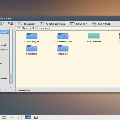
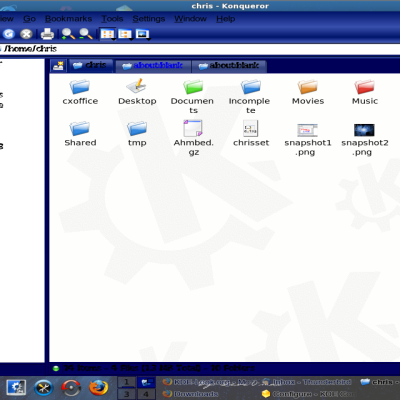
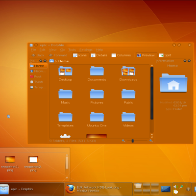
Karma Grey + Colors
Source (link to git-repo or to original if based on someone elses unmodified work):
Description:
The package includes:
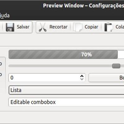
* Karma Grey (QtCurve)
- Karma Grey Colors (Color Scheme)
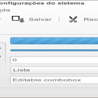
* Karma Florest (QtCurve)
- Karma Florest Colors (Color Scheme)
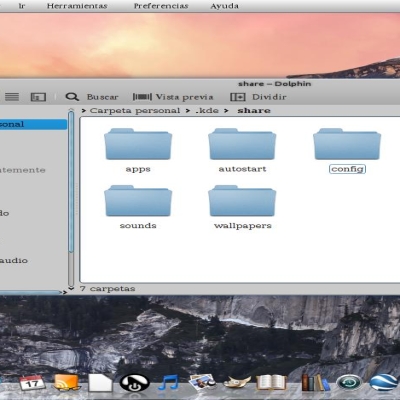
* Karma Ocean (QtCurve)
- Karma Ocean Colors (Color Scheme)
* Karma Outback (QtCurve)
- Karma Outback Colors (Color Scheme)
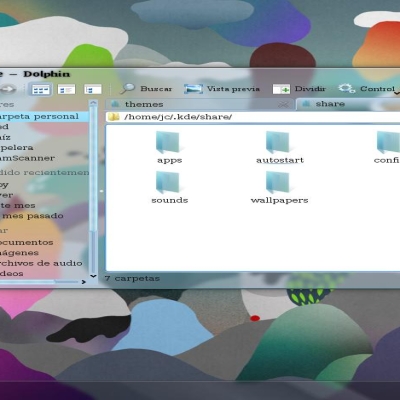
* Karma Paris (QtCurve)
- Karma Paris Colors (Color Scheme) Last changelog:
* Karma Grey (QtCurve)
- Karma Grey Colors (Color Scheme)
* Karma Florest (QtCurve)
- Karma Florest Colors (Color Scheme)
* Karma Ocean (QtCurve)
- Karma Ocean Colors (Color Scheme)
* Karma Outback (QtCurve)
- Karma Outback Colors (Color Scheme)
* Karma Paris (QtCurve)
- Karma Paris Colors (Color Scheme)
1.3 - Bug fixed in Karma Paris and Karma Paris Colors
1.2 - Karma Paris was added
1.0 - Bug fixed in Karma Colors
0.9 - Karma Outback was added
0.7 - Bug fixed in Karma Colors
0.6 - Karma Ocean was added
0.5 - Karma Florest was added
0.3 - Bug fixed in Karma Grey
0.2 - Bug fixed in Karma Grey
0.1 - Karma Grey was created
* Other colors will be added later






Ratings & Comments
10 Comments
I have a problem. When using the grey theme, the menubars on my GTK2 apps have the gradients inverted. Do you know how to fix this?
Also, here's a picture showing what I'm talking about: http://imgur.com/DQqot That's Dolphin on the left, Pidgin on the right.
Thank's for the comment, and for the repport. As I only use Firefox with GTK application and in that system it works very well, maybe that's why the problem has gone well I installed Pidgin, but the theme (not only Gray, but Florest and Ocean too) worked well. I sugest try to use a new maneger to GTK's themes, because in Fedora 15 it's all perfect.
I got it fixed by manually defining the menu bar and title bar gradients manually, instead of using just one for the whole thing. Not the most elegant solution, but it works.
I really love Karma Ocean & Karma Ocean Colors . Thank You very much :)
I like this artwork.. thanks brother :)
Where you get the wallpaper?, looks great :P
The link is http://wallbase.cc/wallpaper/792400
Pretty friggin' gorgeous, mate. That toolbar gradient is especially lovely; I just might have to use that in the next theme I push out :D (giving proper credit, of course)... My only complaint, from a usability perspective, is that there's practically no distinction between the titlebars of active and inactive windows (at least on the crappy low-contrast laptop screen I'm using).
Thanks for the comment. When I have time, I'll straighten out this problem. I thought the difference in the level of shade on the active and inactive windows would be enough to distinguish.