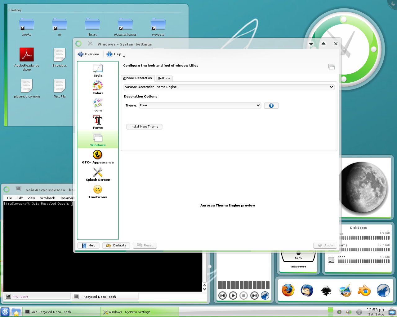
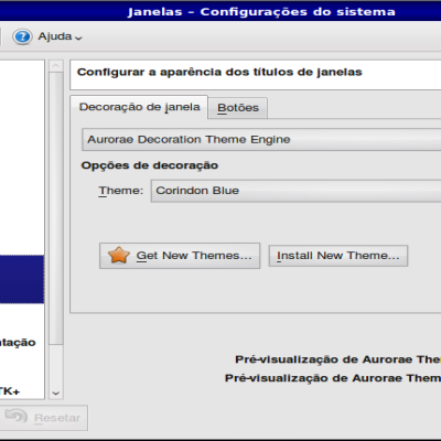
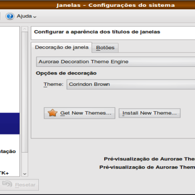
Description: Window decoration intended for use with the Gaia 09 Plasma theme. Aurorae Theme Engine required.
If you arrived here via search engine: This package is the most up to date version for KDE Plasma. For Mac, Windows, and many other versions of Gaia09, you'll find them here: http://www.gaia10.us/09/overview.php
Hehe no problem. Sometimes if the site is not working properly it is best to try again later =)
I will try to make a black version, if I can find the time. I have been very busy lately. I would be have no problems if someone else is interested in doing this.
And please tell me what exactly you think looks bad on the non-compositing version. If you just say it looks bad, that is not very helpful. If it has anything to do with a black border around the edge, I think that is an Aurorae issue.
Well sure, have a look here - http://img198.imageshack.us/img198/787/200908051129271280x800s.png
The colors just dono't fits good.
But strangely the preview from decoration options looks better:
http://img268.imageshack.us/img268/8238/200908051130401280x800s.png
/I changed some sizes, because too big for me :D. Actually, in preview it looks again much better and smaller. I think the problems are not caused by the theme - maybe it is really aurorae engine fault.
This theme is absolutely awesome! But it looks very bad when using it without transparency/composite. Can you make one other version, which fits better when using it without transparency/composite? And maybe one black version, like in gaia for win? :)
Hello jmtodaro!
Your theme is very nice, but it looks good only when using it with transparency and composite enabled.
Could you make one other version, without transparency, to fits better when using KDE without composite? And maybe one black version ...?
Hello @jmtodaro.
Your theme is very nice, but it looks good only when using it with transparency and composite enabled.
Could you make one other version, without transparency, to fits better when using KDE without composite? And maybe one black version ...?
@jmtodaro, the theme looks great, but only when composite is on. Could you make one other version to fits better without transparency and composite? And maybe one black version ...
very nice theme.
i am guessing its impossible yet for aurore themes to have a black border between the window decoration and the window contents.
it would look much better, in my opinion.
thanks
at first, i like your work.
It looks really good but it would be even nicer if there were a green oxygen icon version. That would be awesome. The blue icons does not fit very well.
keep up the good work
I agree, green icons would look very nice with this theme!
However, I've never worked with an icon set before, and I have no intention of learning how to at this time.
There IS a lovely looking Gaia icon set for Windows, perhaps there is a way to convert them for use with KDE - http://www.gaia09.us/entry/win/icons.html
huh sorry for posting this as reply, but there is a strange problem with kde-look, new comments won't appear.
So man, this theme is absolutely awesome! But it looks very bad when using it without transparency/composite. Can you make one other version, which fits better when using it without transparency/composite? And maybe one black version, like in gaia for win? :)


Ratings & Comments
19 Comments
Please move your theme to the new Auroae section!
Uhh!!! Sorry for the comments ... but I think its not my fault ;(
Hehe no problem. Sometimes if the site is not working properly it is best to try again later =) I will try to make a black version, if I can find the time. I have been very busy lately. I would be have no problems if someone else is interested in doing this. And please tell me what exactly you think looks bad on the non-compositing version. If you just say it looks bad, that is not very helpful. If it has anything to do with a black border around the edge, I think that is an Aurorae issue.
Well sure, have a look here - http://img198.imageshack.us/img198/787/200908051129271280x800s.png The colors just dono't fits good. But strangely the preview from decoration options looks better: http://img268.imageshack.us/img268/8238/200908051130401280x800s.png /I changed some sizes, because too big for me :D. Actually, in preview it looks again much better and smaller. I think the problems are not caused by the theme - maybe it is really aurorae engine fault.
This theme is absolutely awesome! But it looks very bad when using it without transparency/composite. Can you make one other version, which fits better when using it without transparency/composite? And maybe one black version, like in gaia for win? :)
Hello jmtodaro! Your theme is very nice, but it looks good only when using it with transparency and composite enabled. Could you make one other version, without transparency, to fits better when using KDE without composite? And maybe one black version ...?
Hello @jmtodaro. Your theme is very nice, but it looks good only when using it with transparency and composite enabled. Could you make one other version, without transparency, to fits better when using KDE without composite? And maybe one black version ...?
@jmtodaro, the theme looks great, but only when composite is on. Could you make one other version to fits better without transparency and composite? And maybe one black version ...
very nice theme. i am guessing its impossible yet for aurore themes to have a black border between the window decoration and the window contents. it would look much better, in my opinion. thanks
if you mean something like this (look on konqueror) http://img218.imageshack.us/img218/5999/snapshot02.png it's possible.. not with Aurorae (windeco theming engine).. but with QuantumStyle (style theming engine) http://kde-look.org/content/show.php/QuantumStyle?content=101088
at first, i like your work. It looks really good but it would be even nicer if there were a green oxygen icon version. That would be awesome. The blue icons does not fit very well. keep up the good work
i'm not sure if there are all KDE icons but you can try this http://www.gnome-look.org/content/show.php/Oxygen-Refit+2+-+Green+Version?content=84683
thx, they are looking good but that are gnome icons.. i don't know if its possible to use them with kde4.
ok, its possible to use the gnome icons.. :) but they aren't looking good. They are clumpy and the original icons are a lot charper.. thy anyway
I agree, green icons would look very nice with this theme! However, I've never worked with an icon set before, and I have no intention of learning how to at this time. There IS a lovely looking Gaia icon set for Windows, perhaps there is a way to convert them for use with KDE - http://www.gaia09.us/entry/win/icons.html
i was just looking for those icons for kde
huh sorry for posting this as reply, but there is a strange problem with kde-look, new comments won't appear. So man, this theme is absolutely awesome! But it looks very bad when using it without transparency/composite. Can you make one other version, which fits better when using it without transparency/composite? And maybe one black version, like in gaia for win? :)
Actually you can easily change color of the defaults ones. Go to System Settings -> Icons -> Advanced -> Set effect -> Colorize.
i never knew about this ;) thanks